UCI Controller
UCI Controller is a User Control Interface (UCI) design feature that is an alternative method of building UCIs. The traditional method involves copying controls from design components into a UCI, which thus ties that UCI to the design. UCI Controller, however, allows you to build a UCI from a list of template control types (Toggle, Knob, etc.), link one or more controls to components in the design, and then write a dedicated Lua script for the UCI. The UCI, and its script, can then be easily copied, re-used, and modified as desired.
- Select User Control Interfaces from the left-side pane.
- Click
 and select New User Control Interface.
 - Select the new UCI (for example, "Interface 1").
- In the right-side pane, under Properties, configure the UCI as desired. See User Control Interface Properties.
- In the middle pane, select Page 1.
- In the right-side pane, under Properties, configure the UCI page, including its Title. See Page Properties.
- Add control elements to the UCI page to build your UCI. See Adding Controls to a UCI Page.
- To add more pages, see Working with Pages
- To configure layering within a page, see Working with Layers.
Think of Layers as stacked, transparent sheets of glass on which you can create images. You can see through the transparent areas of a layer to the layers below. You can work on each layer independently, experimenting to create the effect you want.
Adding layers to your UCI allows you to separate items on your UCI page. When you create a page in the UCI, it will always have at least one layer by default.
You can add a layer to a single page, or create a shared layer that can be used across multiple pages.
- Select a page name.
- Click
 > Add Layer to add a layer to the selected page.
 - Add content to the layer – copy and paste or drag and drop items onto the selected layer.
You can create shared layers to easily share content between multiple pages. You add content to a shared layer the same as any other layer.
- Click
 > Add Shared Layer. The new shared layer is added at the Page level of the UI elements list.
 - Add content to the layer – copy and paste or drag and drop items onto the selected layer.
- In the UI elements list, drag the shared layer name under the desired page names.
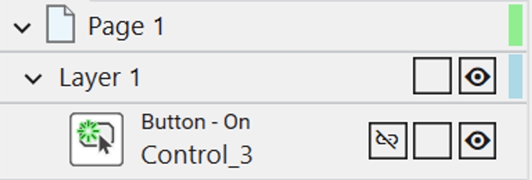
Once a control has been added to your Layer it will have the following:

-
An icon will depict the type of control or graphic tool it is. These icons match the icons found in the UCI toolbox, making it easier to recognize.
-
Each control displays its function at the top (e.g., "Fader - Classic" or "Button - Toggle"), for a more complete description.
-
A name, which depending on the type, will display differently
-
A control from the UCI toolbox will display its custom ‘Control Name’ which can be edited in properties
-
A control dragged from a schematic page will display its control named defined by the system
-
A graphic tool (Text Block, Header, etc) will show the custom text applied to it, when applicable
-
-
Continue adding and renaming controls as needed to create a well-structured and easily navigable UCI.
- To view the layers within a UCI page, click the drop-down arrow next to the page name.
- Click
 or
or  to move a layer. Content on higher layers displays on top of the content on lower layers.
 - Click
 to delete the selected layers. You can delete a layer from the left pane regardless of its visibility or lock state.
- Click
 to hide or show a layer or an element within a layer. The
  icon indicates the layer or element is visible.
  Notes
Notes- When a layer is hidden you cannot select any content on that layer.
- You can delete the layer and the content on the layer is also deleted.
- Click
 to lock or unlock a layer or a layer element. The
  icon indicates the layer is locked.
 Notes
Notes- You cannot add, delete, or move any content on a locked layer.
- You can delete the layer when it is locked or unlocked.
- You can script actions of the layers. For more information, see UCI.
Link a UCI control to a component control in your design, and then easily re-link (or un-link) the control later if the UCI's use case changes. You can thus build an entire UCI and link its controls to components without ever having to wire anything in the design itself. There are two methods to link controls.
Using Link Icon
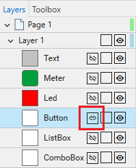
- With your UCI selected, click the Layers tab.
- For the control you wish to link, click the Link icon. For example, here is a UCI control configured as a toggle:

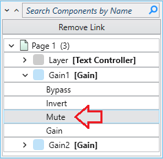
- Select the component and control from that component to link to the UCI control. For example, here we have linked the toggle control to the Mute button of a Gain component:

Tip: If you later wish to link the UCI control to another component control, just click the Link icon again and select a different control for linking.
Using Drag and Drop
- In the schematic window, click and hold the desired component control you wish to link.
- Drag the control to the UCI tab/window.
- While hovering over the button/shape in the UCI, press and hold Ctrl on the keyboard.
- Release the mouse/trackpad while still holding Ctrl and a prompt will appear. Select from the following:
- Link Control - Links the control to the current control design
- Transfer Control Style - Links and overwrites with the original component control graphic
Tip: If you later wish to link the UCI control to another component control, just repeat the drag and drop process while selecting a different control for linking.
Adding Controls from the Toolbox
- Select a UCI name from the User Control Interfaces section of the left-side pane.
- Click the Toolbox tab. You'll see a list of control types:

Note: The functionality of the Graphic Tools section differs from that of the Graphic Tools in the Schematic Elements tab. Graphic Tools within the UCI Tool box can be dragged out like other controls, initially appearing at a default size which you can adjust after placing them in the UCI. In contrast, the Graphic Tools in the Schematic Elements tab enable you to draw around items in the schematic.
- Drag a control type into the UCI Layout Tab.
- In the right-side Properties pane, assign a unique Control Name that can optionally be referenced in a UCI Script.
- Configure the rest of the control's properties as you would with any other control.
- Add more controls as desired.
Deleting Controls from the Toolbox
- Select a UCI name from the User Control Interfaces section of the left-side pan.
- Find the control that was dragged into the UCI Layout Tab.
- Click on the control and press the delete key.
For more detailed information, visit Working with UCI Variables.
The UCI Script tab contains a familiar interface for authoring Lua code specific to the selected UCI. This makes it easy to duplicate a UCI and update the new one (i.e., modify the script) with different parameters. One use case, for example, is having multiple UCIs with differing Layer and Shared Layer visibility settings.
Note: Some Lua methods are not supported – see Unsupported Lua methods for details. When referencing the UCI Lua methods in your UCI script, it will not work if you define the UCI_Name variable because the script is local to the UCI and its name.
Examples
Note: When using the UCI.SetLayerVisibility within a UCI script, you must drop the argument of UCI_Name.
Here is a simple UCI script that sets layer visibility.
timer0 = Timer.New()


timer0.EventHandler = function()
  Uci.SetLayerVisibility('Page 1', 'Layer 1', false, 'fade')
  Timer.CallAfter(function()
      Uci.SetLayerVisibility('Page 1', 'Layer 1', true, 'fade')
    Uci.SetLayerVisibility('Page 1', 'Layer 2', false, 'left')

    Timer.CallAfter(function()
        Uci.SetLayerVisibility('Page 1', 'Layer 2', true, 'left')
    Uci.SetLayerVisibility('Page 1', 'Layer 3', false, 'right')

      Timer.CallAfter(function()
          Uci.SetLayerVisibility('Page 1', 'Layer 3', true, 'right')
    Uci.SetLayerVisibility('Page 1', 'Layer 4', false, 'top')

        Timer.CallAfter(function()
            Uci.SetLayerVisibility('Page 1', 'Layer 4', true, 'top')
    Uci.SetLayerVisibility('Page 1', 'Layer 5', false, 'bottom')

          Timer.CallAfter(function()
              Uci.SetLayerVisibility('Page 1', 'Layer 5', true, '')

          end,1)
        end,2)
      end,2)
    end,2)
  end,2)
end


timer0:Start(10)This line instructs the a Shared Layer in a UCI to become hidden with a fade transition.
Uci.SetSharedLayerVisibility('Shared Layer 1', false, 'fade')Unsupported Lua methods
Some Lua methods are not supported in UCI scripts, including methods from the following libraries. If you use these methods in the UCI Script tab, you will see this error in the Debug Output window: "This feature is unavailable in UCI Controller."
Note: These Lua methods are not supported in the UCI Scripts tab.
|
|
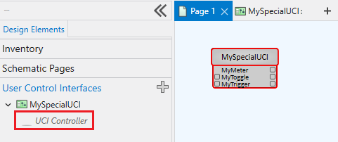
You can optionally expose control pins for each control that you have added to the UCI from the Toolbox, and then wire those control pins as you would with other components. Use the UCI Controller component to view and wire Toolbox control pins.
- In your UCI, select a Toolbox control and configure the Control Pin property. You choose to expose Input, Output, Both, or no (None) control pins.

- From the User Control Interfaces left-side menu, drag the UCI Controller component for your UCI into the schematic.

- Wire the control pins as you would with other components.
Standard Control Pins
The UCI Controller component includes the same standard script control pins as other scripting components, selectable from the Control Pins section of the right-side pane.
|
Pin Name |
Value |
String |
Position |
Pins Available |
|---|---|---|---|---|
|
Code |
(text) Allows you to enter code. |
Input / Output |
||
|
Script Start |
(trigger) Starts the script running. |
Input / Output |
||
|
Script Status |
(text) Current status of the script. |
Output |
||
|
Script Stop |
(trigger) Stops the script. |
Input / Output |
||
Import and export UCIs to facilitate easy sharing between system designers. You can also download and import UCIs from Q-SYS Library.
Note: To learn more about import / exporting, please visit Import and Export UCIs.
