Open topic with navigation
Organizing Your Design
Q-SYS Designer provides several tools and methods to help organize your design.
The following information is covered in this topic:
Labeling Schematic Elements
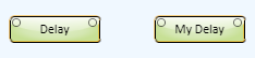
When you have a large design it can be difficult to tell which element you're looking at if you have many of the same elements in the design. Labeling the Schematic Elements can help reduce the confusion.
Renaming Schematic Elements
Some of the elements can be named through the Properties, for example, Cores, I/O Frames, and others. For the elements that cannot be renamed in the Properties, you can change the description by simply selecting the element and start typing. After you have finished typing, press the Enter key - the description is changed.
Graphic Tools
You can use the Graphic tools to label and group items in your Schematic.
Button Icons
You can identify buttons that have been placed in the Schematic or UCI by dragging a bitmap graphic file into the button. In addition, you can copy an object from a vector type graphic program into the Schematic, then drag it into a button. When it is placed into the button, the graphic is sized for the button. You cannot use an icon file (.ico).
 Related Topics
Aligning Schematic Elements
Shortcuts for Alignment
The following keyboard shortcuts are used when you have more than one Schematic Element selected. When the Schematic Elements are selected, you can right-click one of the selected components, and a pop-up menu displays with the choices listed below.
- Ctrl+L = Align Left
- Ctrl+T = Align Top
- Ctrl+B = Align Bottom
- Ctrl+R = Align Right
The following shortcuts align the objects to the left, right, top or bottom, and vertically or horizontally packs them so there is no space between the components.
- Ctrl+Shift+L = Pack Left - aligns left, packs vertically
- Ctrl+Shift+T = Pack Top - aligns top, packs horizontally
- Ctrl+Shift+B = Pack Bottom - aligns bottom, packs horizontally
- Ctrl+Shift+R = Pack Right - aligns right, packs vertically
The following alignment and pack tools are available on the Tools menu.
- Horizontal Align Center - moves the components horizontally to align the centers on a vertical line. Available on right-click menu.
- Vertical Align Center - moves the components vertically to align the centers on a horizontal line. Available on right-click menu.
- Horizontal Distribute Center - distributes the selected components horizontally based on the vertical center of the component. Components of differing widths cause the spaces between the components to be different. Available on right-click menu.
- Horizontal Distribute Equal Space - distributes the selected components horizontally based on the space between the components. All the spaces will be equal. Available on the right-click menu.
- Vertical Distribute Center - distributes the selected components vertically based on the horizontal center of the component. Components of differing heights cause the spaces between the components to be different. Available on right-click menu.
- Vertical Distribute Equal Space - distributes the selected components vertically based on the space between the components. All the spaces will be equal. Available on the right-click menu.
- Horizontal Pack Center - moves the components horizontally to align the centers on a vertical line, and pack them together with no space between them.
- Vertical Pack Center - moves the components vertically to align the centers on a horizontal line, and pack them together with no space between them.
Manual Alignment
You can select one or more Schematic Elements and drag them into the desired position. The following information describes tolls provided in Q-SYS to assist with alignment.
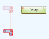
- When you drag one Schematic Element near another, alignment lines display from the corner of one of the elements, to the corner of the other when the corners are in alignment
- When you drag a Signal Snake close to an element with connectors, the alignment lines display when the connectors are in alignment. The alignment lines also display when the new position of the connectors on the Signal Snake align with the old position.
- To make fine, incremental adjustments to the position of an element, you can select the element, and use the arrow keys to move it. Pressing Ctrl+<arrow key> increases the increment by 10.
Numeric Positioning and Alignment
You can select one or more components and/or controls, and position them using numeric values available in the Position field of the component Properties.
You can select one or more controls and position and size them using numeric values available in the Size field of the Control Properties.
To Position a Component or Control
The positions are numbered from the upper left corner of the Schematic starting at zero (horizontal and vertical) to a maximum of 2000 (horizontal and vertical).
- Select the components and or controls you want to position.
- The current position of the item displays in the Position field of the Properties. If multiple items are selected, and either or both horizontal and vertical positions are different, NaN (Not a Number) displays instead of numeric values.
- Select one of the values in the Position field. The values are separated by a comma with the value on the left representing the horizontal position, and the value on the right representing the vertical position.
- Enter the desired value for the selected position (horizontal or vertical). The selected components and/or controls all move and align to the new position.
- If you change the horizontal position, the items are aligned to their left edge.
- If you change the vertical position, the items are aligned to their right edge.
- If you have multiple items selected, and you change both the horizontal and vertical position, they will stack one behind another; only the top one is visible. This is not recommended.
To Size a Control
The maximum value is 2000 for both horizontal size and vertical size.
- Select the control or controls you wish to resize.
- The current size of the item or items displays in the Size field of the Control Properties. If the values of the controls are different, NaN displays instead of a numeric value.
- In the Control Properties Size field, select one of the values. The values are separated by a comma with the value on the left representing the horizontal size, and the value on the right representing the vertical size.
NOTE: When you have a control selected, and you have clicked in the Size Property for that control, you can adjust the vertical size of the selected control using the cursor up/down arrow keys.
- Enter the new size.
- If you have multiple controls selected and change the horizontal size, the left side of the control remains constant, while the right side moves to meet the new size requirement.
- If you have multiple controls selected and change the vertical size, the top of the control remains constant, while the bottom moves to meet the new size requirement.
Ordering Schematic Elements
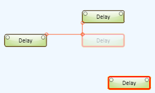
When you place an item in the Schematic, it is placed in order in the Z axis, back to front. The newer items are in front of the older items. You can change that order using the following procedure.
- Select the component
- Do one of the following
- From the main menu select Tools>Order>Bring to Front Ctrl+] or Send to Back Ctrl+[
- Press Ctrl+] to bring the item to the front, or press Ctrl+[ to send the item to the back
- Right-click the item and select the Bring to Front icon, or the Send to Back icon
You can order more than one item by selecting multiple items then using one of the methods above. When you do this, the selected items move to the front of all other items, but maintain the order between themselves.
Copy and pasting, or duplicating an item always places that item in the front just as adding an item from the Schematic Library, Inventory, or other.
Locking and Unlocking Schematic Elements
Locking a Schematic Element allows you to maintain the position of elements in the design mode.
- You can lock any item you can place in the Schematic.
- When a Schematic Element is locked, you cannot select it, move it, or open/close its Control Panel.
- In the Design mode, you can connect wires, or use signal names.
- In the Emulate mode, you can adjust controls in the Control Panel if it was open when the component was locked.
To lock a Schematic Element, select the Element or Elements you wish to lock, and from the Main Menu, select Tools > Lock, or right-click the component and select the lock icon.
To unlock all the locked items, from the Main Menu, select Tools > Unlock All, or right-click the component and select the unlock icon.
NOTE: Because you cannot select a locked item, you cannot unlock a single item from the main menu, it must be all. However, if you use the right-click method you can unlock the single item you right-clicked.
Headers, Text, Boxes, and Other Graphics
You can add Headers, Text Blocks, and Group Boxes to organize, annotate, and enhance the appearance of your design / User Control Interface using the following Graphic Tools. For complete information see Graphic Tools.
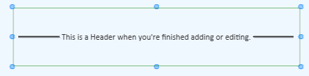
Header
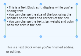
Text Block
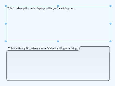
Group Box
Pasting Lists into Headers, Text Boxes, and Group Boxes
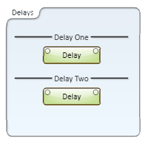
If you have a list of items, or a set of sequential numbers, you can select the list/sequence and paste it into a group of Headers, Text Blocks, or Group Boxes. The list or sequence must be either tab delimited, or on separate lines (carriage returns).
- In Q-SYS Designer, add the number of boxes you need to accommodate the list.
- Arrange the boxes in either a column or row. The resulting order, after pasting, is in the order of the list, either top to bottom or left to right.
- Select the list you wish to paste. The list can be in a word processor, a Q-SYS Text Block (not Header or Group Box), or other application that can produce a tab delimited list, or lines with carriage returns.
NOTE: There are other methods of creating a list that can be pasted into Q-SYS boxes, and some that won't work. For example, you cannot paste a list from Microsoft Excel. However, if you copied the list from Excel into Microsoft Word, it becomes a table that you can paste into Q-SYS boxes. Other applications have not been tested.
- In Q-SYS Designer, elect the group of boxes you wish to populate with your list.
- Paste the list using Ctrl+V or from the Main Menu, Edit > Paste.
Bitmap and Vector Graphics
You can add pictures and graphics from other applications to the Q-SYS Designer Schematic, or User Control Interfaces (UCI). Described below are some of the ways you can add various types of graphics.
When you bring a graphic into Q-SYS from another application it will always display behind any of the Q-SYS objects, i.e. Components, Links, and so on. If you bring in multiple graphics from other applications, the front to back order (z-order) is initially, the last one brought in is on top. If you save the design, then reopen it, the order may change. It is recommended that you do not use multiple graphics where the z-order is important, or that you merge the graphics in the order in which you want them before you bring them into Q-SYS.
Bitmaps
Some of the bitmap file types you can use are .bmp, .png, .gif, .tif and, .jpg. You can add these file types by:
- selecting the file in Windows Explorer and dragging it into the Schematic or UCI,
- opening the file in an editing program such as Microsoft Paint, selecting the picture or portion of the picture, copy the selection, then paste it into Q-SYS Designer.
- You can also copy bitmaps from some web sites.
Vector Graphics
You can copy and paste vector type graphics from the application in which they were created, to the Q-SYS Designer Schematic or UCIs.
- Open the vector application file in its native environment.
- Select one or more of the objects in the drawing.
- Copy the selection.
- Paste the selection into Q-SYS.
You cannot drag a vector-type file into Q-SYS as you can a bitmap file.
Schematic Pages
To organize and increase the overall size capability of your design schematic, Q-SYS supports multiple pages of schematics.
- To add a page to your schematic, click the plus sign on the Schematic Pages accordion bar or in the top right corner of the page. A new page is added.
- To move from one page to another, select the tab of the page to which you wish to go.
- To delete a page from your schematic, in the left-side pane under the Schematic Pages accordion bar, select the page you want to delete and press the Delete key or from the Main Menu select Edit > Delete. Anything on that page will be deleted.
- To rename a page, double-click the current page name on the page tab, or in the Schematic Pages list, and type the new name.
- To close a page, click the
 on the tab of the page you wish to close. The tab of that page is no longer available on the bottom of the Schematic.
- To open a closed page, in the Schematic Pages list, double click the page you wish to open. The tab of that page displays at the bottom of the Schematic to the right of the last tab.
- To connect Schematic Elements across pages, use Signal Names.
- Right-click a tab to:
- Close the tab.
- Float the tab. Floating allows you to move the page separate from Q-SYS Designer.
- Dock the tab. Returns the page to its previous state in the Q-SYS Designer interface. When the tab is floating, you must click the title bar to access the drop-down menu.
- Create a Tab Group.
- Move a page from one Tab Group to another.
Tab Groups
You can divide the Schematic Page area into multiple sections called Tab Groups. You can create Vertical and/or Horizontal Tab Groups add and/or delete Schematic Pages from a group and move pages between the groups. Tab Groups can be added or "ungrouped" in the Design, Emulate or Run modes.
Initially you must have more than one Schematic Page in your design. If you already have Tab Groups, you must have more than one Schematic Page in a Tab Group in order to create an additional group.
To add a Tab Group to your design:
- Right-click one of the Schematic Page tabs; a drop-down menu displays. The tab you click is the one used to make the new Tab Group.
- Select New Vertical Tab Group, or New Horizontal Tab Group.
You can create as many Tab Groups as you have tabs. Once you create a new Tab Group, you can add Schematic Pages to the group, and move pages from one group to another.
Coloring in Q-SYS
Each item that you can add to your Schematic has its own color assigned. There is no particular color coding scheme to the default colors assigned to the various items, but you can assign custom colors for your own purposes.
You can control the color Properties of only some items while they are in a Control Panel. An item can have one or more of the following color Properties:
- Fill Color
- All items have the Fill Color Property.
- When the Fill Color is displayed as a diagonal white top and black bottom, you can click the Fill Color box to display the color matrix, and then adjust the transparency of the item using the slider control at the bottom of the color matrix.
- When you use the eye dropper to copy a color, the Fill Color, of the item being copied, is used.
- Stroke Color
- Must set the Stoke Width to something other than 0.
- Applies only to Group Boxes and Text Blocks
- Transparency can be adjusted the same way as described for Fill Color.
- Text Color
- Applies only to Group Boxes and Text Blocks.
- Transparency can be adjusted the same way as described for Fill Color.
- Background Color
- Applies only to Meters.
- Can be adjusted in or out of the Control Panel.
Basic Techniques
Use the color chart to select colors.
- Select the item or items of which you want to change the color.
- In the Properties section, click the current Fill color patch. If multiple different-colored items are selected, the color defaults to a light yellow. The color chart displays.
- Click the new color. The color chart closes, and the item in the Schematic and the Fill color patch change to the newly selected color.
Use the eyedropper tool to copy colors.
NOTE: The eyedropper always copies the Fill color of an item. Some items, like a button, have multiple states, each having a different color. If the item is in a state where the Fill color is not visible, you still get the Fill color of the item, not the currently visible color.
- Select the item or items of which you want to change the color.
- In the Properties section, click the eyedropper tool. The cursor changes to an eyedropper.
NOTE: If you pass the eyedropper cursor over an open Control Panel, or anywhere outside of the Schematic, it changes to the standard cursor, but the eyedropper function is still Active.
- Click the item having the color you want to copy to the selected item. The following are the rules for items you can use to copy colors from with the eyedropper tool.
- You can copy colors from any Component in the Schematic, for example, Gain, Mixer, Core Status components, and so on.
- You can copy colors from controls, indicators, meters, text, or graphic lines in an open Control Panel or directly in the Schematic.
- You cannot copy colors from the background of the Schematic, Control Panel, Group Boxes
- You cannot copy colors from anything outside of the Schematic area.
Coloring Buttons and LEDs
In Q-SYS, buttons and LEDs have at least two states: binary 0 and 1, off and on. Each application of a button may have different text outputs that don't necessarily relate to off/on, but work with 0/1. For example, an Invert button uses normal and inverted. For the purposes of selecting colors for buttons and LEDs, this topic uses 0 and 1 and off, on. The 0 (off) state is typically the default state of a button and uses a duller color than the 1 (on) state although both colors are in the same color range.
The control you want to color must not be in a Control Panel. You must drag the control from the Control Panel to either the Schematic or a User Control Interface (UCI) before you can change its color.
- Select the control of which you want to change the color.
- In the Properties, change the Fill color using either method described above under Basic Techniques. Both the Fill color and the Off Color change. The Fill color to the color you selected, and the Off Color to a duller color selected by Q-SYS.
OR
- Select the control of which you want to change the color.
- In the Properties, click the chain link icon
 next to the Off Color patch. The icon changes to an open link
  . The colors can now be changed independently.
- Change the color of either or both the Fill color or the Off Color.
Related Topics
© 2009 - 2016 QSC, LLC. All rights reserved. QSC and the QSC logo are trademarks of QSC, LLC in the U.S. Patent and Trademark office and other countries. All other trademarks are the property of their respective owners.
http://patents.qsc.com.