Open topic with navigation
User Control Interfaces
The Q-SYS User Control Interface (UCI) provides a means by which a User can control defined parts of a Q-SYS design via a networked device such as the Q-SYS Touch Screen Controller (TSC) panel, Windows based PC, Apple iPad, iPhone, and others. The UCI is created in Q-SYS Designer, and has one or more pages that can contain controls, indicators, and graphic objects dragged in from the Schematic. Graphic objects and images can also be inserted directly into UCI pages by dragging and dropping, or copying and pasting from other applications (Not all applications support both methods.).
Once a UCI is created, you can deploy it for use in several ways including the Q-SYS TSC-8, TSC-3, Q-SYS UCI Viewer and UCI Viewer Status\Control component for Windows, and Apple iOS devices. Refer to the Deploying User Control Interfaces section of this topic for details.
You can control access for individual UCIs based on individual Users through the Q-SYS Administrator.
IMPORTANT: Due to the finite amount of memory on any hardware, creating large UCIs can cause performance issues on the device hosting the UCI. Pay particular attention to smaller devices such as those that use the Apple iOS.
Inventory Status
The Inventory Status UCI, is a system-generated UCI that lists the status of all components in your inventory that have a Status field available. This UCI can not be modified other than by adding or removing items from the Inventory. The components do not have to be in the Schematic to be listed.
By default, there is one UCI page (Default Location) available. When enough Inventory items are added, and for each hardware location defined, Q-SYS generates another page, and continues until all Inventory is listed. When there is more than one page, a Navigation page is generated with buttons to select each page. On the individual pages, there is a single button labeled "Home" that takes you back to the Navigation Page.
The Inventory items are ordered by location, each location having its own page, then the order in which they were added to the Inventory by type. For example, if you add a Page Station first, all Page Stations in the same location are listed first, if you then add an Amplifier in the same location as the Page Stations, all Amplifiers are added under the Page Stations.
Properties
User Control Interface Properties
To access the Properties for a UCI, you must select the UCI (not one of its pages) in the left-side pane under User Control Interfaces.
|
Title
|
User-defined name to uniquely identify the UCI. The Title does not display unless there is more than one Page for the UCI.
|
User Defined
|
|
Panel Type
|
Custom – Provides the option to manually set the Diagonal Size, and the Horizontal and Vertical Resolution. By adjusting the Horizontal and Vertical Resolution, you control the aspect ratio/ Orientation.
Generic – Provides three aspect ratios: 16:10, 16:9, and 4:3. In addition, you can manually set the Diagonal Size and the Orientation.
iPad – Provides control of the Orientation. The Diagonal Size is set at 9.7 inches.
iPad Mini – Provides control of the Orientation. The Diagonal Size is set at 7.9 inches.
iPhone – Provides control of the Orientation. The Diagonal Size is set at 3.5 inches.
iPhone 5 – Provides control of the Orientation. The Diagonal Size is set at 4.0 inches.
iPhone 6 – Provides control of the Orientation. The Diagonal Size is set at 4.7 inches.
iPhone 6 Plus – Provides control of the Orientation. The Diagonal Size is set at 5.5 inches.
TSC-3 – Three-inch capacitive touch screen provided by QSC.
TSC-7 – Seven-inch capacitive touch screen provided by QSC,
TSC-8 – Eight-inch capacitive touch screen provided by QSC.
The Q-SYS Designer components for the TSC-3 and TSC-8 and TSC-7w are found in the Inventory.
|
Custom
Generic 16:10
Generic 16:9
Generic 4:3
iPad
iPad Mini
iPhone
iPhone 5
iPhone 6
iPhone 6 Plus
TSC-3
TSC-7w
TSC-8
|
|
Orientation
|
Set to the orientation of the screen used to display the UCI. All Panel Types can be manually set, with the exception of the TSC-8 which is set to Landscap.
|
Landscape
Portrait
|
|
Diagonal Size (in.)
|
Set to the diagonal measurement of the screen used to display the UCI. Manually adjustable for Custom and Generic Panel Types.
|
1 to 200
|
|
Location (Tabs)
|
Available when there is more than one UCI page, and the Location Property is not "None".
Gives you the option to select the position of the Tabs used for navigation between multiple pages. If there is only one page, there are no Tabs.
NOTE: If you plan to use Tabs, add them prior to adding any controls. When you add Tabs, the usable area for placing controls changes.
|
Bottom
Left
None
Right
Top
|
|
Style (Tabs)
|
Available when there is more than one UCI page, and the Location Property is not "None".
Gives you the option of Classic, or Chevron style tabs.
|
Classic
Chevron
|
|
Font Size (Tabs)
|
Available when there is more than one UCI page, and the Location Property is not "None".
Controls the size of the font for the Tabs as displayed on the UCI.
|
6 to 64
|
|
Stroke Color
|
Available when there is more than one UCI page, and the Location Property is not "None".
Sets the color of the border between the tabs and UCI page.
|
Many |
|
Stroke Width
|
Available when there is more than one UCI page, and the Location Property is not "None".
Sets the width of the border between the tabs and UCI page.
|
|
|
Swipe Disabled
|
Turns the Swipe function on the touch screen on and off.
|
No
Yes
|
|
Horizontal Resolution
|
Available only with the Custom Panel Type.
|
1 to 10,000
|
|
Vertical Resolution
|
Available only with the Custom Panel Type.
|
1 to 10,000
|
|
Private
|
Set this to Yes to hide this UCI from the iOS and Windows UCI viewers. You will be able to view this UCI on the TSC-8s and TSC-3s connected to your Q-LAN network.
|
No
Yes
|
|
Enable Button Swiping
|
Enables buttons that are behind images to be swiped.
|
No
Yes
|
Page Properties
Each page you add has its own Properties.
|
Fill
|
Select the background color of each individual UCI page.
|
Multiple
|
|
Title
|
To identify a UCI Page. Displays as a tab on the left side, and only when there is more than one page. In addition, you can change the Title by clicking the Page listed under the UCI in the User Control Interfaces list. Click the Page, then click directly on the Title to edit it.
|
User Defined
|
Building a User Control Interface
Building a UCI consists of adding controls and other items to the UCI in the UCI Design Interface. You can do this by the methods listed below. Once you a number of items in your UCI, you will probably want to arrange them to increase usability and appearance. Q-SYS provides a number of tools to do that.
- Properties - the Properties of a selected item are located in the right side pane of the Q-SYS Designer workspace, and contain the following items:
- Position coordinates of a selected item allow you to place an item exactly where you want it to be. The left number controls horizontal placement of the left side of the selected item, the right number controls the vertical placement of the top edge of the selected item.
- Control the Size of the selected item. The left number controls the width (horizontal), and the right number controls the height (vertical) size of the item.
- Other items in the Properties include Fill color, Corner Radius, Stroke Color, Stroke Width, and Text Color, Size, Weight, and Horizontal Alignment.
- In the UCI Design Interface there are a number of tools you can use:
- In the Tools drop-down menu there is Group / Ungroup (Ctrl+G) / (Ctrl+Shift-G), Align, Distribute, Pack, and Order.
- Guidelines - When you open the UCI Design Interface, the working area is defined by a light blue background surrounded by gray area. If you place your cursor in the gray area above or to the left side of the working area, you will see a guideline displayed across or down through the workspace. The guideline moves with the cursor, and coordinates are displayed as you move the guideline.
- Click the cursor where you want the guideline to remain. Continue adding guidelines as needed.
- To move a guideline, move the cursor over the guideline in the gray area then click and hold when the cursor becomes a double arrow over the desired guideline. Drag the cursor to the place you want it. You can zoom in on the area if you need to in order to see the coordinates.
- After setting your guide lines, you can use them to align items in the UCI.
- Copy/cut and Paste UCI pages.
- To copy or cut a UCI page, select the UCI page under the UCI in the User Control Interfaces panel, then press Ctrl+C/Ctrl+X, or select Edit > Copy/Paste.
- Select the destination UCI, and press Ctrl+V or select Edit > Paste. The page now displays in the destination UCI.
Add a User Control Interface to the Design
- Select the User Control Interface accordion bar from the left-side pane.
- Click the plus sign ( +) on the right side of the User Control Interface accordion bar. By default, there are no UCIs listed with the exception of the system-generated Inventory Status. The first time you click the plus sign a new UCI displays in the list with a single page, and the UCI layout window displays. The layout window is "docked" as a tab on the top of Q-SYS Designer interface. You can right-click the tab to choose to "float" the window.
- Click the newly added UCI under the User Control Interface accordion bar. The Properties for the UCI display in the right-side pane.
- Select the desired settings in Properties for this UCI. Refer to the User Control Interface Properties.
- If necessary, expand the listed UCI in the left-side pane, and select Page 1 of the UCI. The Page Properties display in the right-side pane.
- Give a unique title to the Page in the Properties. When you name the Page, if there is more than one, the Page Title changes in the page tab in the layout window.
- To add more UCIs, click the plus sign ( +) and select New User Control Interface from the fly-out menu and repeat the appropriate steps in this procedure.
- To add more Pages, click the plus sign ( +) and select Add Web Page to, then select the desired UCI from the list that displays. A new page is added below the selected UCI.
- To change the order of pages in a UCI, expand the UCI in the left-side panel, then click and drag the page to its new position. The changes are reflected in the UCI when it is run.
Add Layers to the UCI Page
|
Adding layers to your UCI allows you to separate items on your UCI page for various reasons. When you create a page in the User Control Interface it has one layer by default. You cannot delete all of the layers on a page, one layer will always be on a page.
Adding or deleting content:
You may copy and paste, or drag and drop items onto the layer. For complete details, refer to "Arranging and Modifying Controls, Adding Text, and Adding Graphic Boxes" below.
To delete content, select the item you want to delete then right-click and select the X to delete the selected item. You cannot delete content from a layer when the layer is not visible, or when the layer is locked.
|
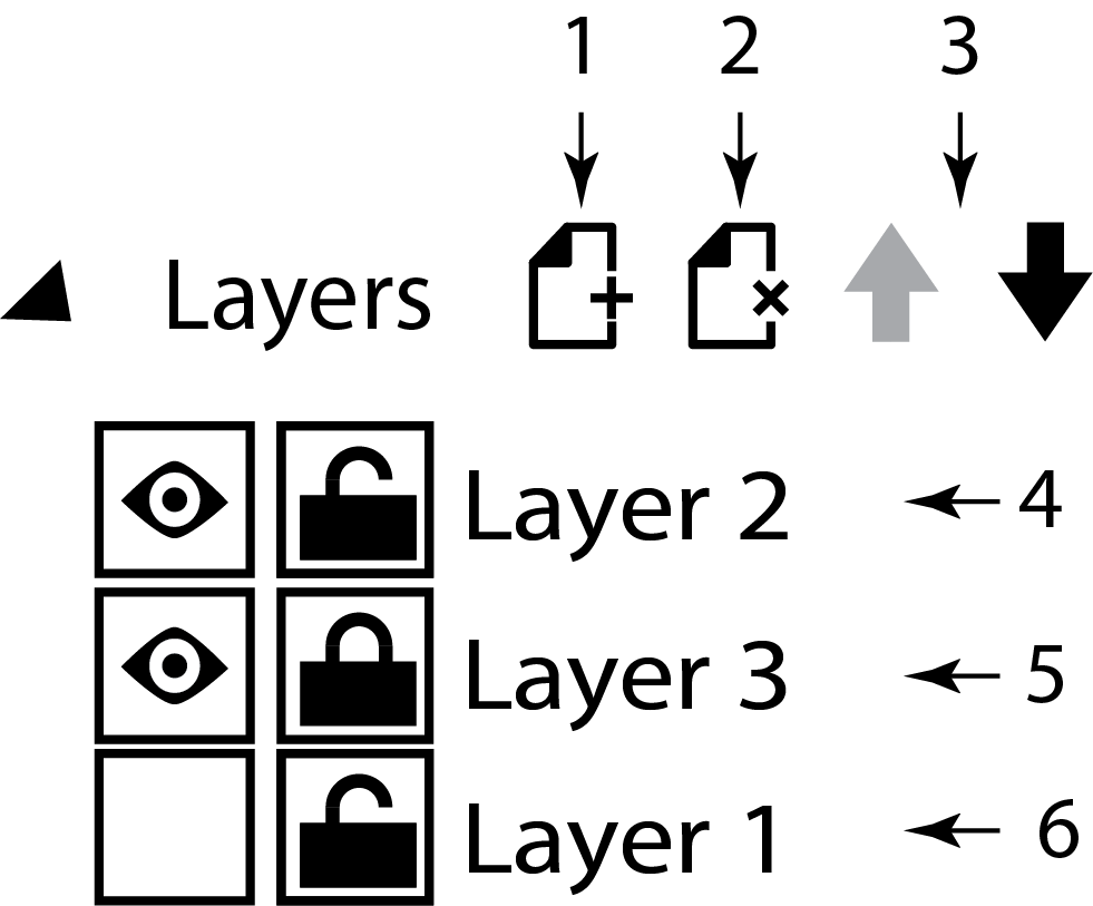
Adding and deleting layers:
- To add a layer, click the add layer icon (1). A new layer is added. Layers are named Layer 1, Layer 2, and so on. If, for example, you rename Layer 1, then add another layer, it is named Layer 1.
- To delete a layer, select the layer in the left pane you want to delete, then click the delete layer icon (2). The layer and any content on the layer is deleted. You can delete a layer from the left pane regardless of its visibility or lock state.
- To move a layer, select the layer you want to move, and click the up or down arrows (3) until it is where you want it. Content on the higher layers displays on top of the content on lower layers.
- To hide or display a layer, select the layer you want to hide (6) or display (4 and 5) and click the eyeball icon. When a layer is hidden you cannot select any content on that layer. You can delete the layer and the content on the layer is also deleted.
- To lock or unlock a layer, select the layer you want to lock (5) or unlock (4 and 6) and click the lock icon. You cannot add, delete, or move any content on a locked layer. You can delete the layer when it is locked or unlocked.
- You can script actions of the layers. For example:
Uci.SetLayerVisibility(<UCI name>, <Page Name>, <Layer Name>, <show>, <transition type> )
Uci.SetLayerVisibility("TSC-7", "Page 1", "Layer 2", true, "top" )
<show> is true or false (show or hide)
<transition type> is one of “fade”, “left”, “right”, “top”, “bottom”
|
|
Adding Navigation and Control Buttons to a UCI Page
When you select None for the Page Tabs Property, you will probably need to provide some type of navigation for the user. Q-SYS Designer provides two ways of adding navigation buttons to your UCI. In addition to the navigation type buttons, there are two control type buttons you can add. The Clean Screen Button allows you to start a timer on a TSC-3 or TSC-8 which disables the touch screen for 30 seconds to allow for cleaning. The Log Off Button will log off of the TSC-3 or TSC-8 touch screen if logging in is required.
- Navigation buttons:
- Method A
- In Design mode, select "page 1". The page displays in the UCI design area.
- Right click and hold "page 2" in the left-side pane and drag it onto "page 1" in the UCI design area. A button displays with the label "page 2".
- You can change the name by selecting the button and simply type a new name, or double-click the button and edit the name.
- You can change various Properties of the button while it is selected.
- Method B
- In the Schematic Library > Layout > UCI, drag the Navigation Button into your UCI design.
- With the button selected, select the UCI page you want in the Properties > Page. The Page property lists all of the Pages in your UCI.
- Polygon buttons:
- In Design mode, select "page 1". The page displays in the UCI design area.
- Select the Polygon Graphic tool from the right-side pane.
- Draw a polygon in the UCI design area.
- Click and hold "page 2" in the left-side pane and drag it over the polygon on "page 1". A hover message displays that says "Assign Page to Region".
- Release the mouse button. The page you dragged on to the polygon button is now assigned to the polygon.
- Clean Screen Button
- In Design mode, select the UCI page on which you wish to place the Clean Screen Button.
- From the Schematic Library > Layout, drag the Clean Screen Button into your UCI page.
- When the design is run on a TSC-3 or TSC-8 Touch Screen, this button starts the 30 second timer allowing you to clean the screen.
- Log Off Button
- In Design mode, select the UCI page on which you wish to place the Log Off Button.
- From the Schematic Library > Layout, drag the Log Off Button into your UCI page.
- Emulate or Run the design.
- In Q-SYS Administrator, select the User Control Interfaces tab.
- Double click the UCI design containing the Log Off button.
- Make sure that the Require User Logon field is set to Yes, and that at least one User is assigned.
- Save the changes.
- When the design is run, this button logs the user off. You must enter a logon password to gain access.
- URL Button
- In Design mode, select the UCI page on which you wish to place the URL Button.
- From the Schematic Library > Layout, drag the URL Button into your UCI page.
- With the URL button selected, in the component Properties, enter the url you wish to connect to.
- Run the design.
- Make sure the device (UCI viewer, or iOS device) used for this UCI is running and connected to the UCI.
- If necessary, select the page containing the URL button, and click the button.
- The UCI opens your default browser and the url assigned to the button.
Add Controls to the User Control Interface Layout Window
NOTE: You must have at least one element of your design in the Schematic before you can add any controls or indicators to the UCI layout page.
NOTE: Currently, the Equalizer, Dynamics components, and the 2D Matrix Panner cannot be displayed in a UCI. As of Q-SYS Designer 4.1, you can add the Responsalyzer, and RTA controls to the UCI's.
Refer to the Controls section of the About Schematic Elements topic for details about using controls.
- Select the Page in the layout window to which you are going to add the controls.
- Open the Control Panel for one of the Schematic Elements in your design.
- Select one or more controls in the Control Panel
- Click a single control
- Click multiple controls using Ctrl+click
- Use Ctrl+A to select all the controls in the Control Panel, including graphics. Make sure the Control Panel is selected before pressing Ctrl+A.
- Once the desired controls are selected, drag, or copy and paste them into the UCI layout window. The controls you add to the UCI are directly linked to the controls in the component from which you selected them.
- You can arrange the controls in the UCI layout window as desired. Keep in mind that if you decide to change the location of the Tabs, the layout of controls may have to change.
Arranging and Modifying Controls, Adding Text, and Adding Graphic Boxes
IMPORTANT: Because of the differences in the native Windows and Air text generation, there may be alignment differences between the UCI, and the deployed display. Before commissioning a UCI on a Web Control Interface, test it to be sure the alignment is adequate.
The following list of actions can be done in any order, and are optional.
- Arrange the controls by dragging. Alignment indicators display when the top/bottom/side is in alignment with another control in the layout. You can also select a group of controls and use the Alignment and Pack features from the Main Menu > Tools > Align or Pack.
- Change the Properties of a control.
- Select the control. The Properties for that control display in the right-side pane.
- Change the Fill color, or any of the other Properties listed for the control. Depending on the style of control, different properties are available.
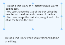
A Text Block, when not selected, looks like a plain line of text with nothing surrounding it.
- Add a Text Block using the Text Block tool.
- Click the
 (Text Block tool) under Graphic Tools in the right-side pane.
 - Click and hold the mouse button approximately where you want one corner of the Text Block to begin.
- Drag the mouse in the direction you wish, when the Text Block is approximately the size you want, release the mouse button. A box displays indicating the area in which the text is confined. This box is not visible when you de-select the Text Block.
- You can re-size the Text Block by clicking and holding one of the "handles" on the box and moving it appropriately. If you grab one of the corner handles, you can re-size the height and width at the same time. Pressing the Shift key constrains the height and width proportions.
- You can move the Text Block by clicking anywhere in the Text Block, and while holding the mouse button, move the box where you want it. If you double-click the Text Block, you enter the edit mode and cannot move or re-size the box until you exit the edit mode.
- Set the Properties for the Text Block.
- Position - Sets the position of the text block in the schematic. You can drag as needed, or enter specific coordinates.
- Size - Sets the size of the text block.
- Fill - Initially, the Text Block is transparent. The Fill changes the color of the background. Click the color sample in the Fill property to select from a panel of colors, or click the eyedropper then click an item in the Schematic or layout window having the color you want to use. After changing the color, you need to set the transparency of the background with the slider at the bottom of the color pallet.
- Corner Radius - Initially, the Text Block has square corners, the Corner Radius allows rounded corners.
- Stroke Width - Initially, the Text Block has no border, the Stroke Width must be set in order to have a border. Values are from 0 to 64.
- Text Color - Sets the color of the text using the color pallet.
- Size - Changes the font size (in pixels) for all text in the Text Block. The range is 6 to 64.
- Weight - Changes the font weight: Bold, Normal or Light for all text in the Text Block.
- Horizontal Alignment - Aligns the text horizontally in the Text Block: Left, Center or Right.
- Vertical Alignment - Aligns the text vertically in the Text Block. Bottom, Center, or Top
- Start typing.
- Pressing Enter gives a new line within the text box. The text continues on one line until the Enter key is pressed.
- Pressing the Tab or Esc key will select the text object.
- Pressing the Insert key toggles between inserting text and typing over text.
- Any characters are allowed.
- You cannot add graphics, for example, pictures, to a Text Block.
- When you're finished typing, click somewhere away from the Text Block to de-select it.
- To add another Text Block click the again and repeat the steps above.
- Selecting a Text Block
- Click the Text, or anywhere in the Text Block area.
- Using your mouse, drag a selection box around the Text Block.
- If you created a Text Block but did not enter any text, you cannot see the "box" unless it is selected. You can drag a selection box around the Text Block. It is recommended that you put at least some text in the Text Block before de-selecting it since it may be difficult to find once it is de-selected with no text entered.
- Editing the text in a Text Block
- Double-click anywhere in the Text Block.
- The text in the Text Block is selected. If you start typing, the text is replaced with what you are typing.
- You can click again at the point you want to make edits and add or delete as necessary.
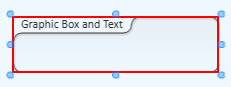
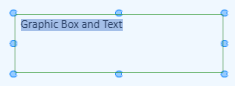
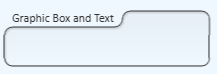
The Graphic Box is a means to visually group objects within a Q-SYS design, or UCI.
NOTE: When you add graphics to a UCI, the images are scaled down for the Panel Type as set in the Properties of the UCI. The images are never scaled up.
Deploying User Control Interfaces
There are several ways you can display a User Control Interface for use:
Q-SYS UCI Viewer for Windows
Install the Q-SYS UCI Viewer on the Windows PC that will be used to view the UCI. Follow the instructions in the installation program. You can download the Q-SYS UCI Viewer from the QSC website as part of the Q-SYS Software download.
Start the UCI Viewer by clicking the UCI Viewer icon.
UCI Viewer Status/Control Component
The UCI Viewer Status/Control component allows you to control various aspects and see the status of a UCI when a UCI Viewer client is associated with the UCI.
 Related Topics
© 2009 - 2016 QSC, LLC. All rights reserved. QSC and the QSC logo are trademarks of QSC, LLC in the U.S. Patent and Trademark office and other countries. All other trademarks are the property of their respective owners.
http://patents.qsc.com.

 Group Box tool.