Graphic Tools are used to organize, label, annotate, and enhance the appearance of your design, or User Control Interface (UCI) layout.
There are four tools available:
After placing one of the graphic shapes in your schematic, you have various options for size, color, weight, and so on. The properties for each shape differ slightly. Refer to the information below for each individual tool.

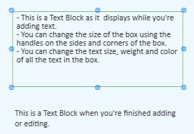
A Text Block, when not selected, looks like a plain line of text with nothing surrounding it.


A Header can be used to give a title to an area of your design, the entire design, and so on.


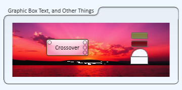
The Graphic Box is a means to visually group objects within a Q-SYS design, or UCI.

NOTE: The Graphic Box does not constrain any of the objects within its boundaries - if you move the box without selecting the objects inside the box's lines, the objects will not move with the box. Only the text associated with the box will move with the box.


![]()
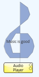
You can create a polygon shape and assign a control to the shape, and when the shape is clicked the control changes state. In the example below, the treble clef is assigned to the Play button of the Audio Player. If it was in a design or UCI, clicking the treble clef sign would start playing the selected file. A Polygon can also be used to group an odd shaped section of your design or UCI.

 Polygon tool.
 tool under Graphic Tools in the right-side pane. As you move the mouse cursor over the Schematic or UCI layout window, the cursor becomes a cross-hair pointer.
Property | Function | Choices |
|---|---|---|
Button Style | Sets the style of button. The following values are available: Custom - Momentary - when the button is clicked, it stays in its opposite state until released. Off - Sets the button off, and it can't be changed except within the Control Panel from which it was copied. If the button is turned on from within the Control Panel, you can turn it off from the button in the Schematic or UCI. On - Sets the button on, and it can't be changed except within the Control Panel from which it was copied. If the button is turned off from within the Control Panel, you can turn it on from the button in the Schematic or UCI. Toggle - Allows you to turn the button on or off. | Custom Momentary Off On Toggle |
Reverse Action | Changes the direction of the control. An example would be if you want to change a mute button (on state is muted, off is passing audio) to an enable button (on state is passing audio, off state is muted). | Yes / No |
Position | You can drag the shape where you want, or use these coordinates to locate in more precisely. | User Defined |
Size | You can drag the shape's handles to size, or use these numbers to size it more precisely. | User Defined |
Fill | Changes the color of the background. Click the color sample in the Fill property to select from a panel of colors, or click the eyedropper then click an item in the Schematic or layout window having the color you want to use. Every color has an associated "off" color. Dual colors are assigned to binary controls such as a toggle button, LED, and so on. When you assign a control to a polygon, the color changes to the polygon's "off" color. When you select a fill color, you are selecting the polygon's "on" color. | Multiple |
Stroke Color | Changes the color of the border. Click the color sample in the Stroke property to select from a panel of colors, or click the eyedropper then click an item in the Schematic or layout window having the color you want to use. Every color has an associated "off" color. Dual colors are assigned to binary controls such as a toggle button, LED, and so on. When you assign a control to a polygon, the color changes to the polygon's "off" color. When you select a fill color, you are selecting the polygon's "on" color. | User Defined |
Stroke Width | Sets the thickness of the border from 0 to 64 | 0 to 64 |
QSC.com | Software and Firmware | Resources | QSC Self Help Portal
© 2009 - 2018 QSC, LLC. All rights reserved. QSC and the QSC logo are trademarks of QSC, LLC in the U.S. Patent and Trademark office and other countries. All other trademarks are the property of their respective owners.
http://patents.qsc.com
