Selector
The Selector component makes it easy to switch between a number of configured values to send to a downstream component. Configure a group of control buttons and assign a value or text string to send when a button is pushed on. One button from the group can be active at a time.
- Drag the Selector component into your schematic.
- Select the component to configure how many selection controls you want. See Properties.
- Connect the Selector component's Value control pin to the input control pin of another component.
- Press F5 to save your design to the Core and run it. (Or, press F6 to emulate your design.)
- Configure the Label and Value for each selection (Sel) button. See Controls.
- Click a selection button (or, use the Selection combo box to select an assigned Label) to enable the selected control and send its assigned value to the connected component.
Inputs and Outputs
Control components do not have traditional input and output pins. If Control Pin is available for the component, an input or output will appear.
Control Pins represent the controls available in the component's Control Panel. Control Pins are used to link controls between Schematic Elements, and link to / from Control Scripts. Control Pin signal pins are represented by a  square, and the wiring is represented by a thick blue / white line.
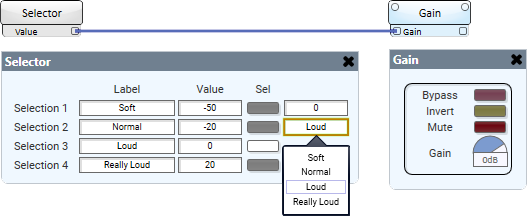
In this example, the Selector component is configured to set the gain value in the Gain component. The user can easily switch between the set gain values by either pressing a Selection button or selecting a label from the combo box.

Selector Properties
Selection Count
Specify the number of control buttons.
Graphic Properties
Label
Use the Label property to change the name of the component in the schematic. The Label property defaults to the component name. To learn more about renaming schematic elements, see Organizing Your Design.
Position
The coordinates reference a specific place in the schematic - for example,"100,100" (horizontal, vertical). 0,0 is the upper left corner of the schematic.
Fill
Sets the fill color of the component in the schematic.
Script Access Properties
Code Name
Displays the currently assign name for control access. You can use the auto-assigned name or customize it. Q-SYS will automatically check all Code Names in the design to ensure name is unique.
Script Access
Defines whether the component will be accessible by script and/or externally, or not at all. Choices include All, External, None (default), and Script.
Tip: Use Script Programmer Mode to quickly view the Script Access setting directly on the component in the design schematic without the need to disconnect from the Q-SYS Core processor.
Label
Specify a text label for the Selection number.
Value
Specify a text string to send to a connected component when the control button is enabled.
Note: The Value you specify must be compatible with the downstream component's control pin. The output does not auto-convert the string. For example, if the downstream component is expecting an integer, you must first send the string though an integer control which can convert the string to an integer.
Sel
Click a button to turn on a Selection. (Or, use the combo box to select an assigned Label.)
Value (output text box)
In Run or Emulate modes, shows the Value currently being sent.
Selection (combo box)
In Run or Emulate modes, select an assigned Label to turn on a Selection.
|
Pin Name |
Value |
String |
Position |
Pins Available |
|---|---|---|---|---|
|
Value |
(text) |
Output |
||
|
Label n |
(user-defined) |
Input / Output |
||
|
Selector |
(text) |
Input / Output |
||
|
Selector n |
0 1 |
false true |
– |
Input / Output |
|
Value n |
(user-defined) |
Input / Output |
||
