Q-SYS CSS Class Reference
This section contains a list of available CSS classes and their intended uses for UCI styles provided by QSC.
Microsoft Teams Rooms
Use this style for Q-SYS room control UCIs displayed on Microsoft Teams Rooms consoles. For more information, see Microsoft Teams Room (MTR).
| CSS Class Name | Description/Usage | Example |
|---|---|---|
|
buttonprimary |
Intended for buttons with primary purpose – for example, function toggles. Fill is light purple when on and dark purple when off. |


|
|
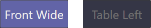
buttonsecondary |
Intended for buttons with secondary purpose – for example, mode selection. Fill is light purple when on and transparent when off. |

|
|
buttonsnapshot |
Intended for snapshot buttons – for example, camera position presets. Fill is light purple when a snapshot is saved and dark purple when not saved. |
|
|
icondown iconup iconleft iconright |
Intended for directional buttons – for example, camera position control. |


|
|
icondownbar iconupbar |
Intended for directional buttons – for example, room temperature control. |


|
|
iconeye |
Intended for buttons for hiding visibility – for example, entering camera privacy mode. |

|
|
iconhome |
Intended for buttons for returning to a home position – for example, a camera's home position. |

|
|
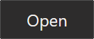
iconpower |
Intended for power buttons. |

|
|
iconvoldown iconvolup iconvoloff iconvolmute |
Intended for volume control buttons. |


|
|
iconzoomin iconzoomout |
Intended for camera zoom controls. |


|
|
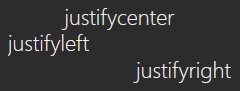
justifycenter justifyleft justifyright |
Use the justify tags in combination with textbodydisplay, textheadingdisplay, textlabeldisplay (shown), or texttitledisplay. |
|
|
textbody |
Body text with a left justify. |

|
|
textbodydisplay |
Body text with a default center justify. Optionally use in combination with justifyleft or justifyright. |

|
|
textboxfader |
Text box with purple fill intended for fader labels. Center justify. |

|
|
textheading |
Heading text with left justify. |

|
|
textheadingdisplay |
Heading text with a default center justify. Optionally use in combination with justifyleft or justifyright. |

|
|
textlabel |
Label text with left justify. |

|
|
textlabeldisplay |
Label text with a default center justify. Optionally use in combination with justifyleft or justifyright. |

|
|
texttitle |
Title text with left justify. |

|
|
texttitledisplay |
Title text with a default center justify. Optionally use in combination with justifyleft or justifyright. |

|