Block Controller
Use the Block Controller component to easily declare one or more controls and their connections, and then build the Lua script associated with those controls using a visual block interface.
After you configure your controls and connections in the elements configurator, you can then build your configuration using a visual programming tool that uses interlocking graphical blocks to represent common code programming concepts including logical expressions and loops. Rapid code creation and editing allows you to compose simple or sophisticated AV scripts while ensuring that the generated code is always syntactically correct.
The underlying script interacts with components through their control pins. You can write scripts to control elements entirely within the Q-SYS Designer file, or you can use it to interface Q-SYS with third-party hardware accessible via TCP, UDP, Serial, or SSH.
- In your schematic, double-click the Block Controller component to open the elements editor.
- In the Controls section, click
 to add a new control.
 - In the Properties section, configure the new control, including its name, count, and type.
- In the Connections section, click
 to add a new connection.
 - In the Properties section, configure the new connection, including its name, type, and control pins.
- Click
 to edit and save the Lua script for your control configuration using a visual block interface.
 - You can add Panels to a Block Controller, by clicking on the
 at the top of the Controller window. After a panel is added, you can name the panels by double-clicking on Panel 1-n. The same capabilities exist for a panel that exist for the schematic page with the exception of wiring.
Note: If there are no Panels, then the "Controls" tab is shown.
Tip: The ‘Edit’ and ‘Add Panel’ buttons are next to the component name for easier access, even with large scripts. The ‘Close’ button stays on the right, but you can double-click the header to close it quickly.
Inputs and Outputs
Control components do not have traditional input and output pins. If a Control Pin is available for the component, an input or output will appear.
Control Pins represent the controls available in the component's Control Panel. Control Pins are used to link controls between Schematic Elements, and link to / from Control Scripts. Control Pin signal pins are represented by a  square, and the wiring is represented by a thick blue / white line.
Tip: For additional properties that are not listed, refer to the Properties Panel help topic for more information.
Block Controller Properties
User Panel Lock
When the property is set to no (Default), a Panel can be deleted by clicking on the X in the Panel tab.
When the property is set to yes, A lock icon appears on the Panel tab preventing any changes within or the option to delete the active Panel.
Display User Panel
Note: If there are no Panels, then the "Controls" tab is shown.
The dropdown will provide Panel 1-n, depending on how many you have set up. Whichever Panel you choose in this dropdown will be displayed by default when opening the Block Controller.
Start Automatically
When the property is set to no, the script will not start when entering emulation or loading a design to a core.
When the property is set to yes (Default), the script will start when entering emulation mode or when loading a design to a core.
Double-click the Block Controller component to open the elements editor, which is where you define controls for your block configuration. After defining your controls, click ![]() to open the Blocks editor.
to open the Blocks editor.
Controls
Click ![]() to add a new control to the list, and then configure its properties. See Controls Properties.
to add a new control to the list, and then configure its properties. See Controls Properties.
Connections
Click ![]() to add a new connection to the list, and then configure its properties. See Connections Properties.
to add a new connection to the list, and then configure its properties. See Connections Properties.
General Properties
Name
Specify a name for the input.
Count
Specify the number of controls of the specified type to create.
Control Type
Category
Select a Push Action:
- Momentary: When the button is clicked, it stays in its opposite state until released.
- Toggle: Allows you to turn the button on or off.
- Trigger: Sends a single command.
- State Trigger: Sends a command when conditions are met. See the State Trigger topic.
Specify a Max Value and Min Value for the specified Units:
- dB: -100 to 20
- Hz: 10 to 20000
- Float: (No limit)
- Integer: -999999999 to 99999999
- Pan: -1 to 1
Note: The Pan range is ignored when setting the Pan value. When setting a pan control value in the Block Controller control panel, the valid range is L100 to 0 (or C) to R100. In the Blocks Editor, the valid range is -1 to 1, where -1 is the equivalent of 'L100', 0 is the equivalent of 'C', and 1 is the equivalent of 'R100'. For example, a value of -0.5 is L50, and a value of 0.5 is R50.
- Percent: 0 to 100
- Position: 0 to 1
- Seconds: (No limit)
Specify a Type: LED, Meter, Text, Status.
Specify a Type: Text Box, Combo Box, List Box
Control Pin
Expose pins for these controls: None, Input (pins on the left), Output (pins on the right), or Both.
Name
Specify a name for the connection and its controls.
Type
Specify how to communicate with the external device:
Expose IP Address, Port, and Status pins for these controls: None, Input (pins on the left), Output (pins on the right), or Both.
- For an example of creating a TCP connection in the visual block interface, see Creating a TCP Socket.
- The TCP connection automatically connects to a specified IP address and port and will retry if the connection is lost.
Expose IP Address, Port, and Status pins for these controls: None, Input (pins on the left), Output (pins on the right), or Both.
Expose Baud Rate, Bits, Parity, and Status pins for these controls: None, Input (pins on the left), Output (pins on the right), or Both. Note that this will expose a serial control pin that needs to be wired to a matching pin on the component that represents the hardware.
For an example of creating a serial connection, see Creating a Serial Connection.
Expose IP Address, Port, Status, User Name, and Password pins for these controls: None, Input (pins on the left), Output (pins on the right), or Both.
- For an example of creating an SSH connection in the visual block interface, see Creating an SSH Connection.
- The SSH connection automatically attempts to connect with the provided login host, port, and credentials.
After configuring your controls and connections, click ![]() to open the Blocks editor (Blocks tab). Controls and connections are presented as graphical blocks that you can drag into the script and configure with values and statements.
to open the Blocks editor (Blocks tab). Controls and connections are presented as graphical blocks that you can drag into the script and configure with values and statements.
- In the Controls and Connections drop-downs, add and configure script components (blocks), as desired.
- If your design contains Named Controls or Named Components, use their drop-down menus to add blocks from those categories.
- Add and configure new blocks (Values, Strings, etc.) from the menu, as desired.
- Click Save changes to commit any changes to your script.
- Click the Lua tab to view your configuration in script form.
For examples of creating controls using the visual block interface, see Block Examples. To modify your script in a traditional script editor, see Using the Script Editor.
Platform-level horizontal scrolling is supported here to navigate layouts that extend beyond the visible workspace. You can scroll horizontally using any of the following input methods:
-
Touchpad Gestures: Use side-to-side (two finger swipes on supported trackpads.
-
Mouse Wheel: Hold the Shift key while scrolling vertically with a mouse wheel.
-
Native HID Devices: Use devices with dedicated horizontal scroll support (e.g., horizontal scroll wheels).
-
Scroll Bar: Use mouse or arrow keys to drag the bar.
Navigation Menu
Arrange
This function organizes and aligns the blocks in a neat and orderly manner, making the design more visually appealing and easier to navigate.
Clear All Blocks
This option removes all blocks from the design canvas, allowing you to start fresh with a clean slate.
Convert to Script
This feature transforms the block-based design into a script, enabling more advanced and customizable control through coding. See Using the Script Editor.
Start Script
This command initiates the execution of the script, allowing the programmed actions and controls to begin operating. This option is initially grayed out until you are in Emulation or Run Mode.
Stop Script
This function halts the execution of the script, stopping all programmed actions and controls. This option is initially grayed out until you are in Emulation or Run Mode.
Restart Script
This option stops the current script and then immediately starts it again, useful for applying changes or troubleshooting. This option is initially grayed out until you are in Emulation or Run Mode.
Right-Click Menu
Undo
This function allows you to revert the last action you performed, effectively undoing any recent changes.
Redo
This option lets you reapply an action that was previously undone, restoring the change you had reverted.
Clean Up Blocks
This feature organizes and aligns the blocks on the design canvas, making the layout more orderly and visually appealing.
Collapse Blocks
This function minimizes the blocks, reducing their size to show only essential information and making the design more compact.
Expand Blocks
This option enlarges the blocks to display all their details, providing a more comprehensive view of the design.
Delete n Blocks
This command allows you to remove all blocks from the design canvas, helping you manage and streamline your layout.
To edit the script using a text-based editor, click the ![]() button and select Convert to Script. The Block Controller component window will update and reflect the properties as seen in Text Controller Controls.
button and select Convert to Script. The Block Controller component window will update and reflect the properties as seen in Text Controller Controls.
WARNING: When you switch to the text-based editor, the editor is initially populated with the Lua script generated from the Block editor. If you later switch back to the Block editor (![]() > Revert to Blocks), your text editor changes are lost. Any text-based script you enter is overwritten by text generated by the Block editor.
> Revert to Blocks), your text editor changes are lost. Any text-based script you enter is overwritten by text generated by the Block editor.
The script editor contains three areas:
- Text editor – Modify the script for your configuration. You can edit the script in the Design, Emulate, or Run modes, but any errors are only detected in the Run or Emulate modes.
- Information bar at the top of the script:
- Click the yellow "Save changes" bar to reload (not run) the script.
- Syntax errors are indicated in a red bar at top-right, as well as in the Debug Output area.
Tip: While in the Script area, press F1 for help on the Lua scripting language.
Platform-level horizontal scrolling is supported here to navigate layouts that extend beyond the visible workspace. You can scroll horizontally using any of the following input methods:
-
Touchpad Gestures: Use side-to-side (two finger swipes on supported trackpads.
-
Mouse Wheel: Hold the Shift key while scrolling vertically with a mouse wheel.
-
Native HID Devices: Use devices with dedicated horizontal scroll support (e.g., horizontal scroll wheels).
-
Scroll Bar: Use mouse or arrow keys to drag the bar.
- Refer to the Q-SYS Lua Environment and the Lua 5.3 Reference Manual topics for information about writing scripts.
- Click the Search bar on the right side of the page to locate or replace text in your script. As a shortcut, press F3 to find the next item.
See Debug Output.
The available Control Pins depend on settings in Properties.
|
Pin Name |
Value |
String |
Position |
Pins Available |
|---|---|---|---|---|
|
Code |
(text) Allows you to enter code. |
Input / Output |
||
|
Script Start |
(trigger) Starts the script running. |
Input / Output |
||
|
Script Status |
(text) Current status of the script. |
Output |
||
|
Script Stop |
(trigger) Stops the script. |
Input / Output |
||
This section demonstrates how you can create controls using the visual block interface, which then generates the underlying Lua script. Refer to the Control Scripting topic for information on Lua scripting.
Serial port communication is supported via the RS-232 ports on some Q-SYS devices. To create a connection:
- In your schematic, double-click the Block Controller component to define the controls and connections using the elements editor.
- Click
 to define the controller configuration in the Blocks editor.
 - Drag the Q-SYS device's Serial Port component into your schematic and wire it to the Block Controller component.
In this example, a trigger button is used to send data (entered in a text box) through the serial port on a Core 110f. For more information on serial port connections, and to see an example of the Lua script used to create this example, see SerialPorts.
Defining controls and connections
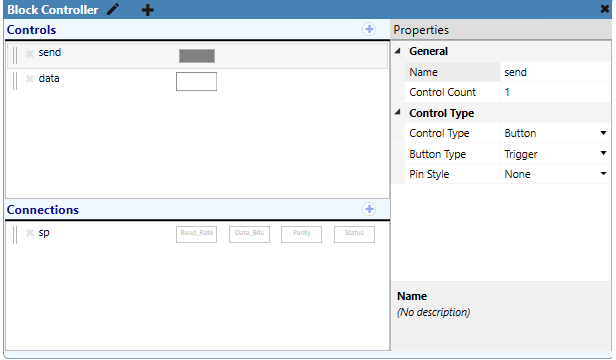
Double-click the Block Controller component to open the elements editor. In this example, two controls and one connection are defined.
Tip: You can drag individual control and connection components into your schematic or copy them to the User Control Interface editor.
Controls
- Trigger button (Control Type = Button; Button Type = Trigger)
- Text box for sending data (Control Type = Text; Text Type = Text Box)
Connections
- Serial port (Connection Type = Serial)

Blocks and script equivalents
Click ![]() to open the Blocks editor. Define the controller configuration using the available blocks in the left menu. The Controls and Connections categories contain the elements defined in the elements editor.
to open the Blocks editor. Define the controller configuration using the available blocks in the left menu. The Controls and Connections categories contain the elements defined in the elements editor.
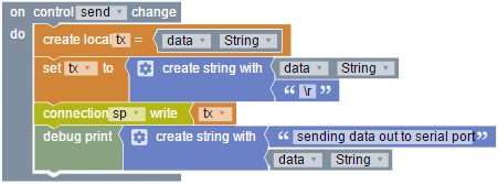
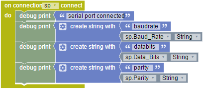
In this example, there are four groups of blocks that do the following:
- Establish the event handler for the trigger button.
- Print out baud rate, data bits, and parity once a connection has been established.
- Print disconnect messaging.
- Print any message received from the device. In the example provided, “Any” does not mean any character. The end of line is any sequence of any number of carriage return and/or linefeed characters. This is the appropriate choice if the protocol uses simply a carriage return as the end of message.
| Blocks | Script Equivalent |
|---|---|
|
Copy
|
|
Copy
|

|
Copy
|

|
Copy
|
Setting baud rate, data bits, and parity
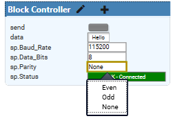
The Block Controller automatically produces script for handling the setting of baud rate, data bits, and parity. When you emulate or save and run your design to the Core, open the Block Controller control panel to set baud rate, data bits, and parity using the drop-down menus.
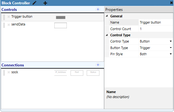
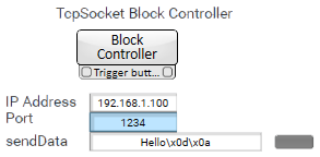
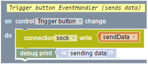
The TcpSocket object allows Q-SYS cores to make client TCP/IP connections to devices on the network. In this example, a trigger button is used to send data entered in a text box to a TCP device with a specified IP address and port number. For more information, and to see an example of the Lua script used to create this example, see TcpSocket.
Defining controls and connections
Double-click the Block Controller component to open the elements editor. In this example, two controls and one connection are defined.
Tip: You can drag individual control and connection components into your schematic or copy them to the User Control Interface editor.
Controls
- Trigger button (Control Type = Button; Button Type = Trigger)
- Text box for sending data (Control Type = Text; Text Type = Text Box)
Connections
- TCP socket (Connection Type = TCP)
Blocks and script equivalents
Click ![]() to open the Blocks editor. Define the controller configuration using the available blocks in the left menu. The Controls and Connections categories contain the elements defined in the elements editor.
to open the Blocks editor. Define the controller configuration using the available blocks in the left menu. The Controls and Connections categories contain the elements defined in the elements editor.
| Blocks | Script Equivalent |
|---|---|

|
Copy
|

|
Copy
|

|
Copy
|

|
Copy
|
|
Copy
|
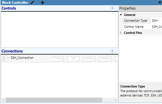
Use SSH to create secure client connections to devices on the network. It is very similar to creating a TCP socket, but requires additional connection arguments (host, port, user, password). For information about creating SSH connections in Lua, see Ssh.
In this example, an SSH connection is configured that:
- Automatically attempts to connect with the provided login host, port, and credentials.
- Writes the date to the connection.
- Prints any messages received from the device.
- Prints a login failure message if the wrong credentials are provided.
Defining controls and connections
Double-click the Block Controller component to open the elements editor. In this example, a new SSH connection is defined. Controls are available for IP Address, Port, UserName, Password, and Status, which can be dragged into your design.
Blocks and script equivalents
Click ![]() to open the Blocks editor. Define the controller configuration using the available blocks in the left menu. The Connections category contains the elements for the SSH connection.
to open the Blocks editor. Define the controller configuration using the available blocks in the left menu. The Connections category contains the elements for the SSH connection.
| Blocks | Script Equivalent |
|---|---|

|
Copy
|

|
Copy
|

|
Copy
|

|
Copy
|

|
Copy
|
Setting connection parameters
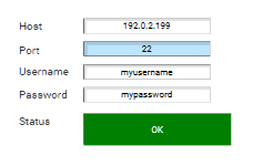
Run or emulate your design. In the SSH connection controls, set the host/IP address, port, username, and password. Block Controller automatically attempts to connect with the provided parameters.
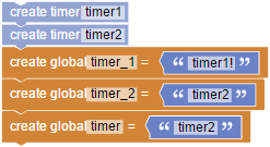
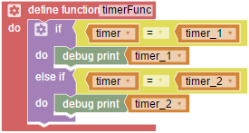
The Timer object is used to create delays or trigger events after a defined elapsed time. It should be used instead of Lua's native delay and time functions. For more information, and to see an example of the Lua script used to create this example, see System.
Blocks and script equivalents
| Blocks | Script Equivalent |
|---|---|
|
Copy
|
|
Copy
|

|
Copy
|

|
Copy
|

|
Copy
|
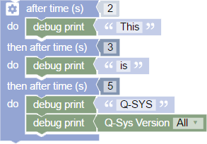
Use the after time block to create a single event or a series of events that execute after a specified period of seconds. Unlike a standard timer, this block only fires once.
To add more events to execute, click the gear icon and drag the then after time block under the after time block.
Blocks and script equivalents
In this example, a series of debug print strings executes in three timed steps.
| Blocks | Script Equivalent |
|---|---|
|
Copy
|
Debug Output
This
is
Q-SYS
7.1.0.27
This example shows how you can use the Block Controller component to create multiple controls (trigger buttons) and then use those controls in a user control interface with layer transitions.
Overview
This example UCI allows the user to push one of six buttons to either show a Q-SYS product category image or remove the current image and show the Q-SYS logo:
There are three overall steps to creating this UCI:
- Defining the control buttons in the Block Controller elements editor.
- Copying those controls from the Block Controller elements editor into the UCI editor and defining layers and button images.
- Defining the controller configuration in the Blocks editor to configure the UCI functionality, including transitions between controls.
Defining controls
Double-click the Block Controller component to open the elements editor. In this example, six controls are defined - each for displaying a different Q-SYS product image (Control Type = Button; Button Type = Trigger).
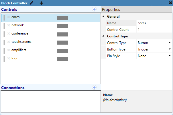
Configuring the UCI
Note: For information on creating UCIs, see User Control Interface (UCI) Design Overview.
- Create a new user control interface and name it "Q-SYS".
- Select and copy each of the six controls (gray rectangles) from the Block Controller elements editor and paste into the UCI editor.
- Configure the properties for each control button in the UCI:
- Set Graphics Properties > Button Style to "Image".
- Set Button Images > On Image to an appropriate button graphic.
- Your UCI will now contain a single layer with six elements (buttons). Rename this layer "buttons".
- Create six new layers – named "cores", "network", "conference", "touchscreen", "amplifiers", and "logo" – each with a large graphic that will be placed in the middle of the display above the buttons layer.
Now, you will have a UCI with one page ("Page 1") containing seven layers:
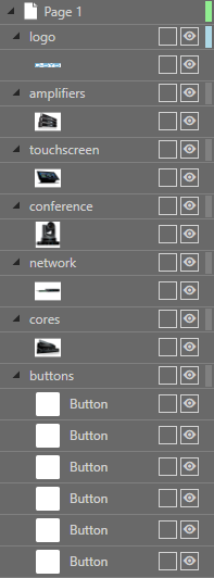
Using the Blocks editor to define the controller configuration
Finally, use the Blocks editor to define the UCI functionality.
- In the Block Controller elements editor, click the
 button to open the Blocks editor.
 - In the Blocks menu, you will see categories for various types of statements, including a Controls category that contains available blocks for each of the control buttons you defined in the elements editor.
- Build the configuration by selecting individual blocks from the menu. This example uses blocks from the Variables and Functions, System, and Controls categories. See the next section for the configuration for this example.
Blocks and script equivalents
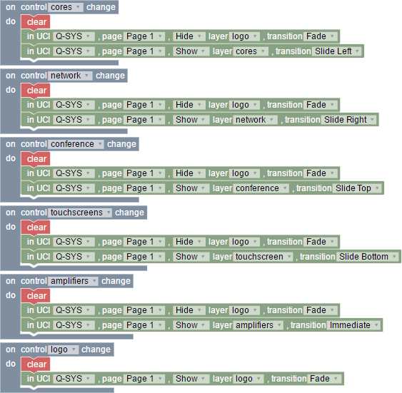
In this example, there are three groups of blocks that do the following:
- Define the "clear" function, which clears the display of all product images with a Fade transition, revealing only the Q-SYS logo.
- Run the "clear" function when starting the UCI.
- Define what occurs when each button is pressed.
Note: For information about the UCI Lua functions used behind the scenes in this example, see UCI.
| Blocks | Script Equivalent |
|---|---|

|
Copy
|

|
Copy
|
|
Copy
|
In this example, a UCI contains two pages with distinct graphics. Two shared layers – one for a Toggle Time control and another for a time display – are used on each page. When the Toggle Time button is pushed, the time display is therefore shown or hidden on both pages.
Note: For information about adding a date/time text box to your UCI, see Date/Time.
Defining controls
In this example, one control is defined (Category = Button; Push Action = Toggle). The button is configured in the visual Blocks editor to turn on/off the shared layer containing the time display.
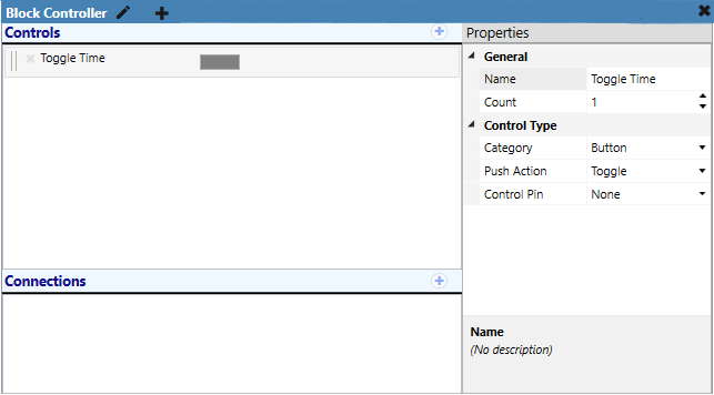
Configuring the UCI
This simple UCI (named "MyUCI") contains two pages, each with a different QSC graphic. Two shared layers - one for the Toggle Time control ("ToggleTime") and the other for the time display ("Time") - are also included on each page. For information about creating shared layers, see User Control Interface (UCI) Design Overview.
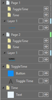
Define the controller configuration
Use the Blocks editor (accessible via the ![]() button) to define what happens when the Toggle Time button is pushed: Show or hide the Time shared layer across any page that includes that shared layer, and with a specified transition type. This example uses blocks from the Flow Control, Operators, System, and Controls categories.
button) to define what happens when the Toggle Time button is pushed: Show or hide the Time shared layer across any page that includes that shared layer, and with a specified transition type. This example uses blocks from the Flow Control, Operators, System, and Controls categories.
Note: For information about the UCI Lua functions used behind the scenes in this example, see UCI.
| Blocks | Script Equivalent |
|---|---|

|
Copy
|
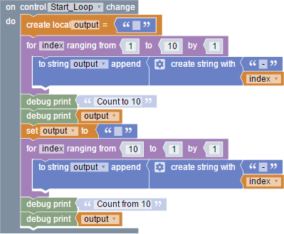
In this example, whenever the Start_Loop button is pushed, two "for loop" blocks start a countdown - one to 10, and one from 10.
| Blocks | Script Equivalent |
|---|---|
|
Copy
|
Debug Output
Count to 10
-1-2-3-4-5-6-7-8-9-10
Count from 10
-10-9-8-7-6-5-4-3-2-1
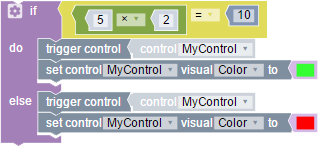
In this example, a trigger button control (MyControl) changes color depending on whether a condition is met.
| Blocks | Script Equivalent |
|---|---|
|
Copy
|
Note: Although you can name a control using an ampersand (&), it causes the block controller to stop processing named controls, resulting in the “Named Component” block options not appearing.
When your design contains Named Controls, blocks for these controls become available in the block editor from a Named Controls drop-down menu:
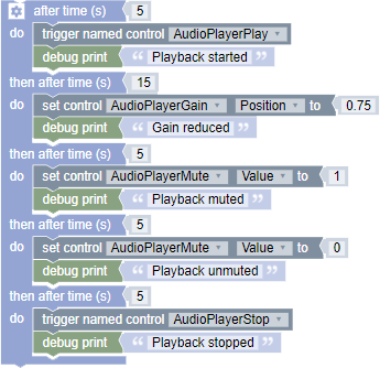
In the following example, a timeline (after time) block is configured to trigger playback and set control values in a timed sequence for four named controls from an Audio Player component.
Note: For more information about timelines, see Creating a Timeline. For information about referencing named controls in Lua script, see NamedControl.
| Blocks | Script Equivalent |
|---|---|
|
Copy
|
When your design contains Named Components, blocks for these components become available in the block editor from a Named Components drop-down menu:
Note: The Named Components section only appears if the script access of the Named Component is set to all or script.
In the following example, an Audio Player component's Code Name has been renamed "MyPlayer". In this simple script, blocks from the Named Components drop-down menu for this named component are configured to enable looped playback whenever the Play button is pressed.
Note: For information about renaming components to create named components, see Labeling Schematic Elements. For information about named components in Lua script, see Component.
| Blocks | Script Equivalent |
|---|---|

|
Copy
|
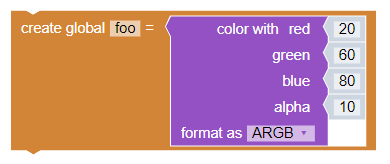
The Color With Block is a feature within the Q-SYS Designer software that allows for the visual management and customize of the colors of various controls and interfaces.
Note: All editable color values in the Block Controller are expressed in percentages only. Ensure that the values range from 0% to 100% for accurate color representation.
Color with Red, Green, and Blue
Red: This value represents the intensity of the red color in the RGB color model. It ranges from 0% (no red) to 100% (full red). For example, an RGB value of (100%, 0%, 0%) means the color is pure red.
Green: Similar to red, this value indicates the intensity of the green color. It also ranges from 0% to 100%. An RGB value of (0%, 100%, 0%) means the color is pure green.
Blue: This value shows the intensity of the blue color, ranging from 0% to 100%. An RGB value of (0%, 0%, 100%) means the color is pure blue.
Format as
RGB: This format uses three values (Red, Green, Blue) to define a color. Each value can range from 0% to 100%. For example, RGB (100%, 65%, 0%) represents the color orange.
ARGB: This format adds an Alpha value to the RGB values, which represents the opacity of the color. The Alpha value also ranges from 0% (completely transparent) to 100% (completely opaque). For example, ARGB (100%, 100%, 65%, 0%) represents an opaque orange color.
| Blocks | Script Equivalent |
|---|---|
|
Copy
|
For further explanation of the Block Controller component, see the following videos:
- Q-SYS Training - Control 101
Learn the basic Q-SYS third party control principles, including Lua scripting basics.
- Q-SYS Training - Block Controller Part A
Learn about the Block Controller component through a navigational overview. In this lesson, you'll learn how to manipulate a simple button control using blocks.
- Q-SYS Training - Block Controller Part B
Learn about sections of the Block Controller, including control change, flow control, if statements, operators, boolean values, and converting blocks to lua script.
