Selector
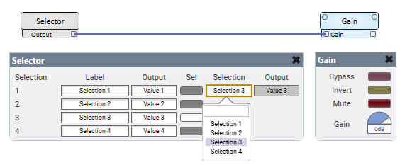
The Selector component makes it easy to switch between a number of configured values to send to a downstream component. Configure a group of control buttons and assign a value or text string to send when a button is pushed on. One button from the group can be active at a time.
Note: The selector component will, when the design starts, select the current selection, which could, depending on what comes after create an undesirable effect.
- Drag the Selector component into your schematic.
- Select the component to configure how many selection controls you want. See Properties.
- Connect the Selector component's Value control pin to the input control pin of another component.
- Press F5 to save your design to the Core and run it. (Or, press F6 to emulate your design.)
- Configure the Label and Value for each selection (Sel) button. See Controls.
- Click a selection button (or, use the Selection combo box to select an assigned Label) to enable the selected control and send its assigned value to the connected component.
Inputs and Outputs
Control components do not have traditional input and output pins. If a Control Pin is available for the component, an input or output will appear.
Control Pins represent the controls available in the component's Control Panel. Control Pins are used to link controls between Schematic Elements, and link to / from Control Scripts. Control Pin signal pins are represented by a  square, and the wiring is represented by a thick blue / white line.
In this example, the Selector component is configured to set the gain value in the Gain component. The user can easily switch between the set gain values by either pressing a Selection button or selecting a label from the combo box.

Tip: For additional properties not listed, refer to the Properties Panel help topic for more information.
Selector Properties
Selection Count
Specify the number of control buttons. Can choose between 2 and 64 counts.
Label
Specify a text label for the Selection number.
Sel
Click a button to turn on a Selection. (Or, use the combo box to select an assigned Label.)
Selection (combo box)
In Run or Emulate modes, select an assigned Label to turn on a Selection.
Output (text box)
In Run or Emulate modes, shows the Value currently being sent.
