UCI Styles
You can install custom Cascading Style Sheet (.css) files to a design, and then apply a selected style to a user control interface (UCI). This makes it easy to apply the same style to multiple UCI elements. It also allows for UCI design uniformity throughout an organization, since the same styles can be used for multiple designs.
Use this procedure for getting started with creating your own styles.
Note: Styles may also be available for download from Q-SYS Asset Manager (Tools > Show Asset Manager).
- Q-SYS Designer checks the following directory for .css files to install:
\Users\user-name\Documents\QSC\Q-SYS Designer\Styles. Within this directory, create a folder for each style. The folder name is used for the style name in Q-SYS Designer. - Create a file called
style.cssand place it in the folder for your style.- Use a common code authoring tool such as Visual Studio Code to write your style.
- Refer to Supported CSS Properties to see what selectors are compatible with Q-SYS UCI design graphic and control elements. Q-SYS supports common CSS selectors.
- If your style uses images or custom fonts, place them in the folder containing your style. Ensure that your .css file refers to the proper subfolders for referenced files.
- Install the style to a design. See Installing, Saving, and Removing Styles.
- Apply the style to a UCI. See Applying and Updating UCI Styles.
Tip: Because style .css files are installed to the design, if you share a design containing installed styles with someone else, that person will also see those styles.
Installing New Styles to a Design
- Place the .css file and any supporting image files into the Styles folder.
- In Q-SYS Designer, create or open a design file.
- Click Tools > Design Resources.
- From the Available list, select the style name, and then click Install Style.
- Close the Design Resources window.
The installed style is now available for selection in your UCI. See Applying and Updating UCI Styles.
Saving Styles from a Design
If a design contains a styles file that is not currently on your local disk, you can save it from the design. You can then edit the file.
- Click Tools > Design Resources.
- From the Installed list, select the style name, and then click
 . The style is now saved to the Styles folder on-disk.
Note: Referenced image files are not saved.
Removing Styles from a Design
- In Q-SYS Designer, create or open a design file.
- Click Tools > Design Resources.
- From the Installed list, select the style name, and then click
 .
. - Close the Design Resources window.
Once you have installed a UCI style file to a design, you can then apply it to a UCI. Applied styles take precedence over individual graphic and control properties in Designer.
- With your design file open in Q-SYS Designer, select User Control Interfaces in the left pane.
- Select your UCI name.
- In the User Control Interface Properties (right side pane), select a Style from the drop-down menu.
- Optionally, use the CSS Class Name property to adjust the assigned classes for a UCI element (button, fader, text box, etc.). An element can belong to as many CSS classes as needed to provide the desired styling.
Tip: Click ![]() to access the Design Resources window from the UCI Properties pane.
to access the Design Resources window from the UCI Properties pane.
Updating Styles
If you modify a styles .css file – either via an update from Q-SYS Asset Manager or in a code editor – Q-SYS Designer detects any changes and prompts you to update the style in your design.
You can modify a .css file whether your design is open in Q-SYS Designer or not. To allow Q-SYS Designer to automatically update styles while your design is open (without prompting), click Tools > Auto Update Styles.
Note: The Auto Update Styles option is not saved with the design. The option reverts to disabled the next time you open your design file.
You can install custom Cascading Style Sheet (.css) files to a design, and then apply a selected style to a user control interface (UCI). This makes it easy to apply the same style to multiple UCI elements. It also allows for UCI design uniformity throughout an organization, since the same styles can be used for multiple designs.
Note: Refer to the Supported CSS Properties topic for compatibility with various Q-SYS control types.
Reference images by providing a path to the image file as the background-image property – for example, for buttons.
.pc{
    background-image: url(images/pc.png);
}Reference custom fonts in your CSS file using the @font-face rule. Make sure to reference the location where your fonts are stored in relation to your CSS file. For example, here is a reference to a font stored in a fonts subfolder at the same level as the CSS file:
@font-face {
  font-family: "My Fancy Font";
  src: url( fonts/fancyfont.ttf );
}

textbox {
  font-family: "My Fancy Font";
}Icon fonts are icons that you can customize in CSS for color, size, and style. Two built-in fonts are included – foundation and material – but you can also reference custom font icons in the same way as custom fonts.
Icon Font Properties
Q-SYS supports icon fonts with these QSC-specific CSS properties. Refer to the Supported CSS Properties topic for compatibility with various Q-SYS control types.
-qsc-icon: The string to use for the icon font.
- If the icon font is defined to be either of the two built-in icon fonts (
foundationormaterial), you can use a friendly string – for example,address-bookoralertfor foundation or3d_rotationorac_unitfor material. - If the icon font is custom, the string must be in CSS-encoded Unicode, as defined by the font's CSS file.
Tip: Foundation icon names can be found at zurb.com. Search for Material icon names at fonts.google.com/icons.
|
Property |
Description |
|---|---|
|
-qsc-icon |
The string to use for the icon font.
Tip: Foundation icon names can be found at zurb.com. Search for Material icon names at fonts.google.com/icons. |
|
-qsc-icon-color |
The CSS-based color to use for drawing the icon – for example: |
|
-qsc-icon-font |
The icon font to use, which can be either be |
|
-qsc-icon-align |
Alignment can be either |
Example
@font-face {
    font-family: dash;
    src: url(dashicons.ttf);
}

/* custom icon */
.dash-friends {
  -qsc-icon-font: dash;
  -qsc-icon: "\f167";
  -qsc-icon-color: green;
}

/* foundation */
.foundation-blind {
  -qsc-icon: blind
}

/* material */
.material-brightness-1 {
  -qsc-icon: "brightness_1";
  -qsc-icon-font: material;
  -qsc-icon-color: yellow;
  -qsc-icon-align: right;
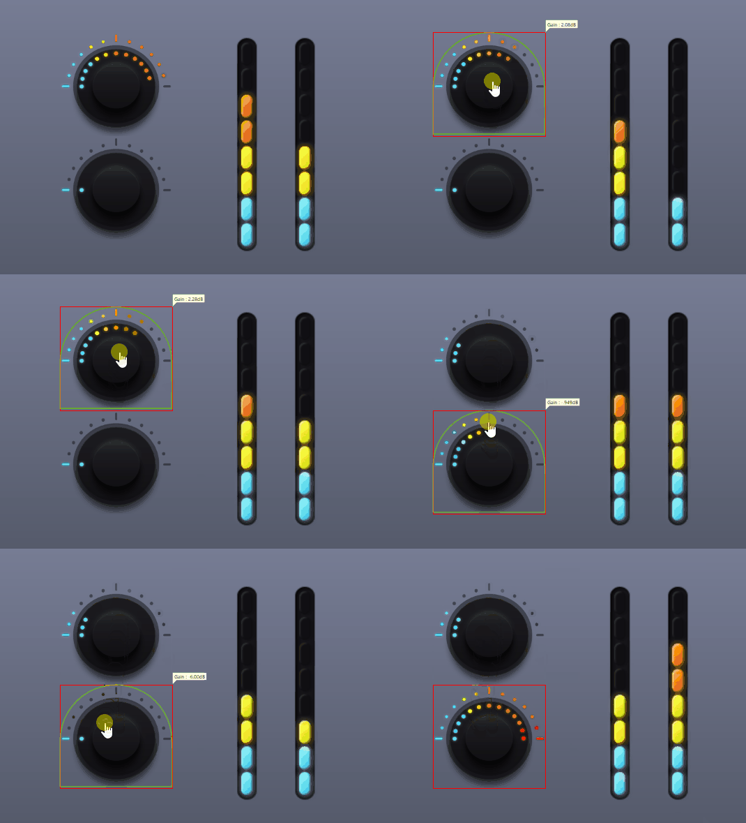
}QSC render styles allow you to customize how meters, knobs, and faders appear within your design based on the position of those controls. There are three render styles available: classic, filmstrip, and layer.
Classic
-qsc-render-style: classic;
This is the default. The control is drawn with no rendering applied.
Filmstrip
-qsc-render-style: filmstrip;
This render style is supported by meters, knobs, and faders and uses the :value() selector to define ‘frames’ of styles that are applied to the control based on the control's current position. When rendering as filmstrip, all the native drawing and styles (for example, Meter Style and Fader Style) are ignored.
Filmstrip supports these CSS properties:
background-colorbackground-imagebordercontent
Layer
-qsc-render-style: layer;
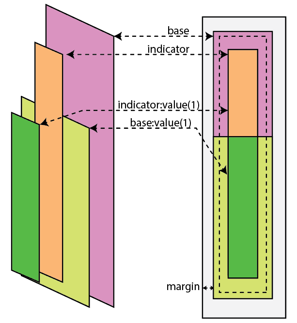
This render style is supported by meters and faders and applies multiple layers to construct the graphic. Each layer is specified by a class property in the main style along with a width and height for each. A layer style can also define a :value(1) selector that can be used to define 'on' layers. The 'on' layers are drawn at the full size of the layer but clipped to the position of the control. If a layer class is not defined, the layer is not drawn at all.
Each layer supports these CSS properties:
background-colorbackground-imageborder
Meters define an additional layer for indicator class, width, and height.
|
Property |
Description |
|---|---|
|
-qsc-meter-indicator-class |
The class name to use to draw indicator |
|
-qsc-meter-indicator-width |
Width of indicator. Supports viewport relative units (vh, vw, etc.) |
|
-qsc-meter-indicator-height |
Height of indicator. Also supports viewport relative units. |
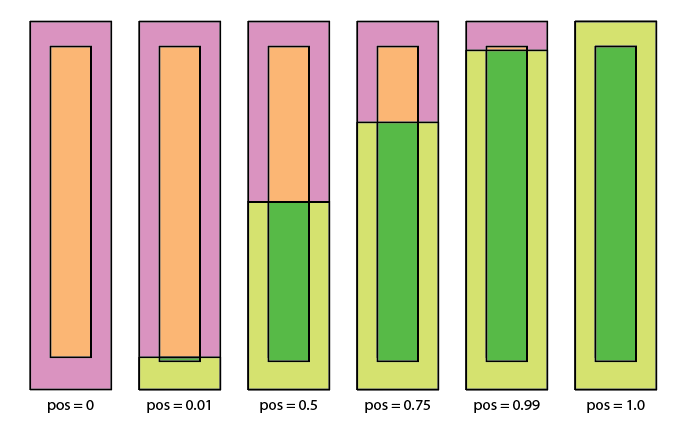
The base:value(1) indicator clip point matches the indicator:value(1) clip point. The end points (position 0 and 1) are special-cased for base:value(1).
- position = 0 : Does not draw at all
- position > 0 and < 1.0 : Draws matching the indicator clip full from bottom
- position = 1 : Draws full size
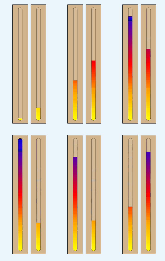
Example
meter {
  -qsc-render-style: layer;
  background-color: tan;
  border: 1px black;
  -qsc-meter-indicator-class : my-indicator;
  -qsc-meter-indicator-width: 50vw;
  -qsc-meter-indicator-height: 100vh;
  padding: 12px;
}

.my-indicator {
  border-radius: 15px;
  border: 1px rgba(0, 0, 0, 0.5);
  background: linear-gradient(to right, rgba(0,0,0, 0.5), rgba(255,255,255,0.1) 40%);
}

.my-indicator:value(1) {
  background:
  linear-gradient(blue, purple, red, orange,yellow);
  linear-gradient(to right, rgba(0,0,0,0.2), rgba(255,255,255,0.2), rgba(0,0,0,0.5));
}
Meters define two additional layers for slot and cap.
|
Property |
Description |
|---|---|
|
-qsc-fader-cap-class |
Class name to use to draw the fader cap |
|
-qsc-fader-cap-width |
Width of cap. Supports viewport relative units (vh, vw, etc.) |
|
-qsc-fader-cap-height |
Height of cap. Also supports viewport relative units. |
|
-qsc-fader-slot-class |
Class name to use to draw the fader slot |
|
-qsc-fader-slot-width |
Width of cap (or height, if horizontal ). Supports viewport relative units. |
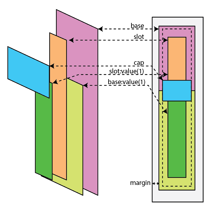
- The width and height of the cap are user-defined.
- The width of the slot is user-defined but the height of the slot is calculated by
slot_height = total_height - cap_height. - The Fader Style property is ignored when drawing.
- Both the base layer style as well as the slot support the
:value(1)selector and are clipped to the center position of the cap. - Faders support the :pressed selector to allow for swapping out styles when the fader is currently being manipulated.
Example
This example corresponds to the image above.
fader {
  -qsc-render-style: layer;
  background-color: pink;
  -qsc-fader-slot-class: my-slot;
  -qsc-fader-slot-width: 10px;
  -qsc-fader-cap-class: my-cap;
  -qsc-fader-cap-height: 80vmin;
  -qsc-fader-cap-width: 80vmin;
}

fader:value(1) {
  background-color: lime;
  -qsc-fader-slot-class: my-slot-on;
}

.my-slot {
  background-color: orange;
}

.my-slot:value(1) {
  background-color: green;
}

.my-cap {
  background-color: blue;
}Here is a simple code example, whereby the background color of the control changes based on the control's position:
.tricolor {
  -qsc-render-style: filmstrip;
  background-color: green;
}

.tricolor:value(0.6) {
  background-color: orange;
}

.tricolor:value(0.9) {
  background-color: red;
}In this example, the control's background image changes based on position:
knob {
  -qsc-render-style: filmstrip;
  border: 0px transparent;
  background-color: transparent;
  background-image: url(k1.png);
}
knob:value(0.08) {
  background-image: url(k2.png);
}
knob:value(0.16) {
  background-image: url(k3.png);
}
knob:value(0.25) {
  background-image: url(k4.png);
}
knob:value(0.33) {
  background-image: url(k5.png);
}
knob:value(0.41) {
  background-image: url(k6.png);
}
knob:value(0.5) {
  background-image: url(k7.png);
}
knob:value(0.58) {
  background-image: url(k8.png);
}
knob:value(0.67) {
  background-image: url(k9.png);
}
knob:value(0.75) {
  background-image: url(k10.png);
}
knob:value(0.83) {
  background-image: url(k11.png);
}
knob:value(0.92) {
  background-image: url(k12.png);
}
knob:value(1) {
  background-image: url(k13.png);
}

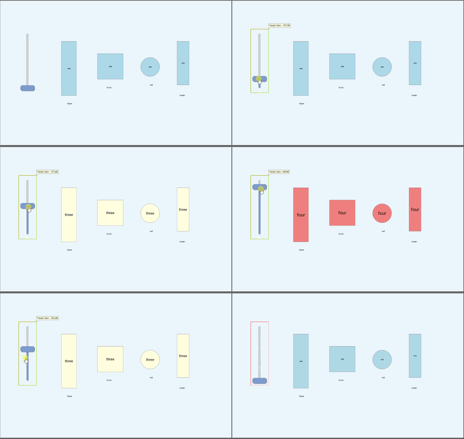
And here's a similar approach showing background styling applied to both the knob and corresponding meter:
.filmstrip {
  -qsc-render-style: filmstrip;
  color:black;
  background-color: lightblue;
  content: "one";
  font-size: 10px;
}

.filmstrip:value(.25) {
  background-color: lightgreen;
  content: "two";
  font-size: 15px;
}

.filmstrip:value(.50) {
  background-color: lightyellow;
  content: "three";
  font-size: 20px;
}

.filmstrip:value(.75) {
  background-color: lightcoral;
  content: "four";
  font-size: 25px;
}

.filmstrip:value(1) {
  background-color: red;
  content: "five!!";
  font-size: 30px;
}
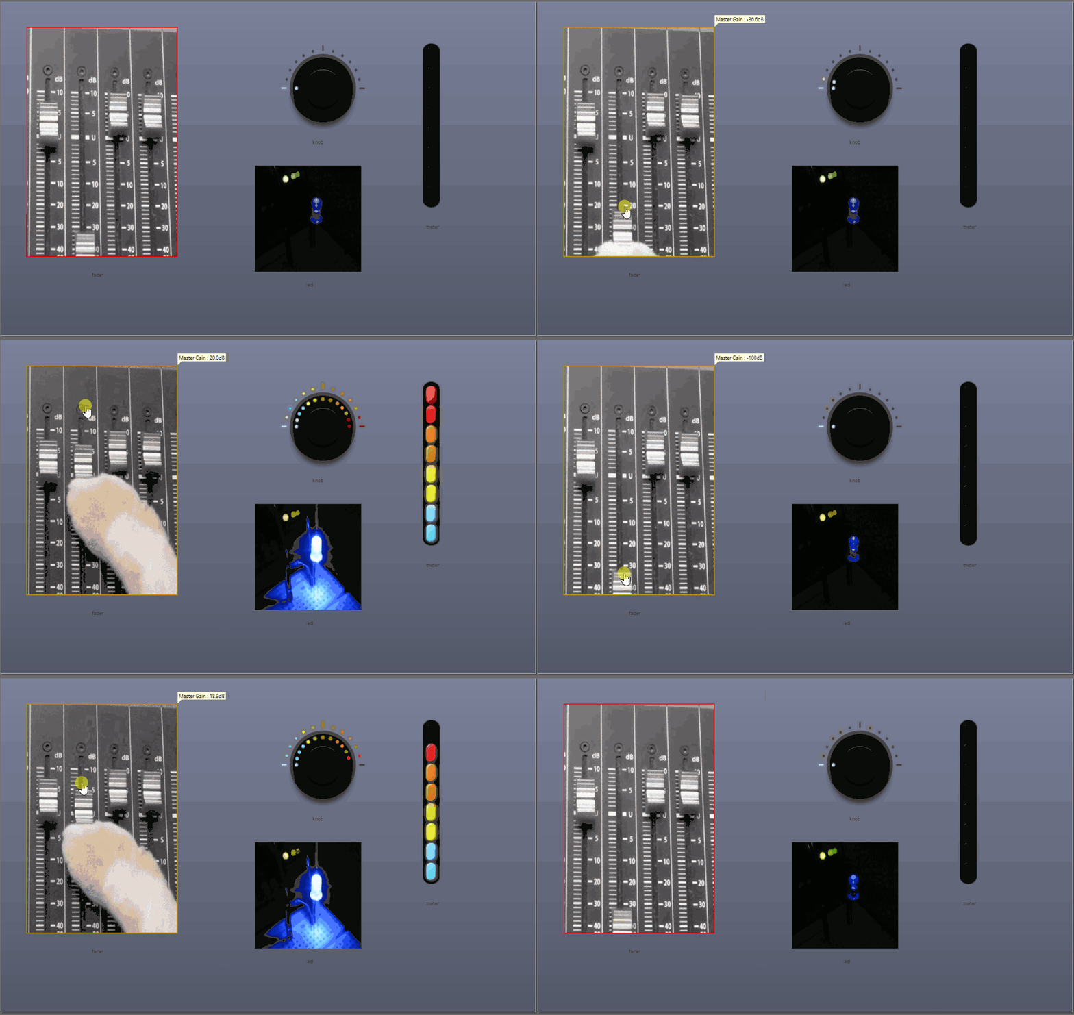
page {
  background-image: linear-gradient(#7b819a, #535868);
  background-color: rgb(236,236,236);
}

knob {
  -qsc-render-style: filmstrip;
  border: 0px transparent;
  background-color: transparent;
  background-image: url(knob/k1.png);
}
knob:value(0.08) { background-image: url(knob/k2.png); }
knob:value(0.16) { background-image: url(knob/k3.png); }
knob:value(0.25) { background-image: url(knob/k4.png); }
knob:value(0.33) { background-image: url(knob/k5.png); }
knob:value(0.41) { background-image: url(knob/k6.png); }
knob:value(0.5) { background-image: url(knob/k7.png); }
knob:value(0.58) { background-image: url(knob/k8.png); }
knob:value(0.67) { background-image: url(knob/k9.png); }
knob:value(0.75) { background-image: url(knob/k10.png); }
knob:value(0.83) { background-image: url(knob/k11.png); }
knob:value(0.92) { background-image: url(knob/k12.png); }
knob:value(1) { background-image: url(knob/k13.png); }

meter {
  -qsc-render-style: filmstrip;
  border: 0px transparent;
  background-color: transparent;
  background-image: url(meter/m0.png);
}
meter:value(0.125) { background-image: url(meter/m1.png); }
meter:value(0.25) { background-image: url(meter/m2.png); }
meter:value(0.375) { background-image: url(meter/m3.png); }
meter:value(0.5) { background-image: url(meter/m4.png); }
meter:value(0.625) { background-image: url(meter/m5.png); }
meter:value(0.75) { background-image: url(meter/m6.png); }
meter:value(0.875) { background-image: url(meter/m7.png); }
meter:value(1) { background-image: url(meter/m8.png); }

led {
  -qsc-render-style: filmstrip;
  border-radius: 0px;
  border: 0px transparent;
  background-color: transparent;
  background-image: url(led/led0.png);
}
led:value(0.14) { background-image: url(led/led1.png); }
led:value(0.28) { background-image: url(led/led2.png); }
led:value(0.42) { background-image: url(led/led3.png); }
led:value(0.56) { background-image: url(led/led4.png); }
led:value(0.70) { background-image: url(led/led5.png); }
led:value(0.84) { background-image: url(led/led6.png); }
led:value(1) { background-image: url(led/led7.png); }

fader {
  -qsc-render-style: filmstrip;
  border-radius: 0px;
  border: 0px transparent;
  background-color: transparent;
  background-image: url(fader/f0.png);
}
fader:value(0.09) { background-image: url(fader/f1.png); }
fader:value(0.18) { background-image: url(fader/f2.png); }
fader:value(0.27) { background-image: url(fader/f3.png); }
fader:value(0.36) { background-image: url(fader/f4.png); }
fader:value(0.45) { background-image: url(fader/f5.png); }
fader:value(0.54) { background-image: url(fader/f6.png); }
fader:value(0.63) { background-image: url(fader/f7.png); }
fader:value(0.72) { background-image: url(fader/f8.png); }
fader:value(0.81) { background-image: url(fader/f9.png); }
fader:value(0.90) { background-image: url(fader/f10.png); }
fader:value(1) { background-image: url(fader/f11.png); }
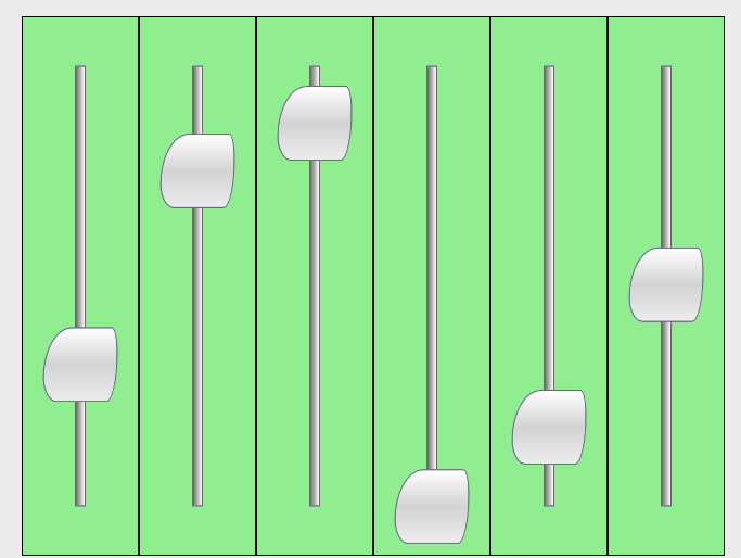
.slot {
  background-image: linear-gradient(to right, dimgray, white);
  border-radius: 0px;
}

.cap {
  background-image: linear-gradient(180deg, white, lightgray 50%,rgb(236,236,236));
  border-radius: 25% 5% 10% 12%;
}

fader {
  -qsc-render-style: layer;
  background-color: lightgreen;
  border: 1px black;
  -qsc-fader-slot-class: slot;
  -qsc-fader-slot-width: 10px;
  -qsc-fader-cap-class: cap;
  -qsc-fader-cap-height: 80vw;
  -qsc-fader-cap-width: 80vw;
}
.tm-cap {
  background-color: transparent;
  border: 0px red;
  background-image: url(slider__cap--x-large-vertical.svg);
  margin: 0% 0% 0% 15%;
}

fader {
  -qsc-render-style: layer;
  -qsc-fader-cap-class: tm-cap;
  -qsc-fader-cap-width: 65vw;
  -qsc-fader-cap-height: 82vw;
  background-image: url(tm-bg.png);
  border: 0px transparent;
}
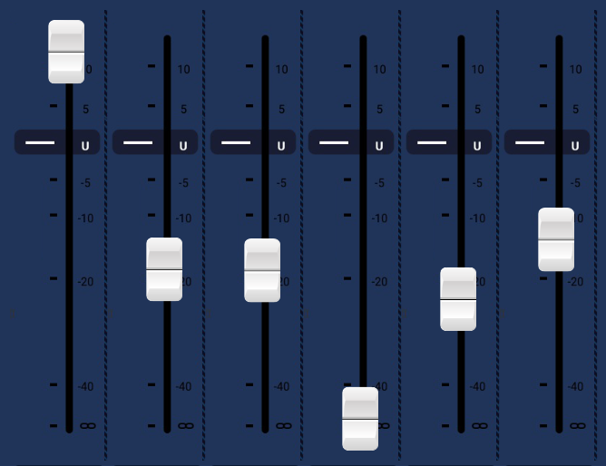
.cap {
  background-image: url(volume-control-cap.png);
}

.glowcap {
  background-image: url(volume-control-cap-glow.png);
}

fader {
  background-color: transparent;
  background-image: url(volume-control-background.png);
  border: 0px transparent;
  -qsc-render-style: layer;
  -qsc-fader-cap-class: cap;
  -qsc-fader-cap-height: 80vh;
  -qsc-fader-cap-width: 80vh;
  padding: 0px 9% 0px 7%;
}

fader:value(1) {
  background-image: url(volume-control-background-on.png);
}

.glowfader {
  -qsc-fader-cap-class: glowcap;
}

.glowfader:value(1) {
  background-image: url(volume-control-background-on-glow.png);
}
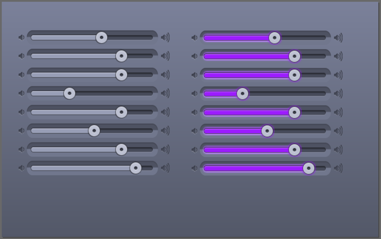
fader {
  background-color: transparent;
  background-image: url(volume-control-background.png);
  border: 0px transparent;
  -qsc-render-style: layer;
  -qsc-fader-slot-class: slot;
  -qsc-fader-cap-height: 80vh;
  -qsc-fader-cap-width: 80vh;
  padding: 0px 9% 0px 7%;
}

fader:value(1) {
  background-image: url(volume-control-background-on.png);
}

.glowpressed:pressed {
  -qsc-fader-cap-class: glowcap;
}

.glowpressed:pressed:value(1) {
  background-image: url(volume-control-background-on-glow.png);
}

.win-slot {
  background-color: lightgray;
  border-left: 2px black;
  border-top: 2px black;
  border-right: 2px white;
  border-bottom: 2px white;
}

.win-cap {
  background-color: lightgray;
  border-left: 2px white;
  border-top: 2px white;
  border-right: 2px black;
  border-bottom: 2px black;
}

fader {
  background-color: lightgray;
  border-left: 2px white;
  border-top: 2px white;
  border-right: 2px black;
  border-bottom: 2px black;

  padding: 30px 5px;

  -qsc-render-style: layer;
  -qsc-fader-slot-class: win-slot;
  -qsc-fader-slot-width: 10vw;

  -qsc-fader-cap-class: win-cap;
  -qsc-fader-cap-height: 40vw;
  -qsc-fader-cap-width: 50px;
}
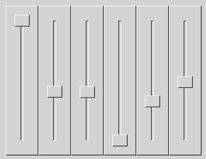
fader {
  -qsc-render-style: layer;
  -qsc-fader-slot-class: fader-slot;
  -qsc-fader-slot-width: 20px;
  -qsc-fader-cap-class: fader-cap;
  -qsc-fader-cap-width: 80vmin;
  -qsc-fader-cap-height: 80vmin;
  background-color: plum;
  border: 1px black;
}

fader.vertical{
  -qsc-fader-cap-width: 80vmin;
  -qsc-fader-cap-height: 80vmin;
}

fader.horizontal{
  -qsc-fader-cap-width: 80vh;
  -qsc-fader-cap-height: 80vh;
}


fader:value(1) {
  background-color: lightgreen;
  border: 1px black;
}

.fader-slot {
  background-color: orange;
  border: 1px black;
}

.fader-slot:value(1) {
  background-color: green;
  border: 1px black;
}

.fader-cap {
  background-color: lightblue;
  border: 1px black;
  border-radius: 15%;
}
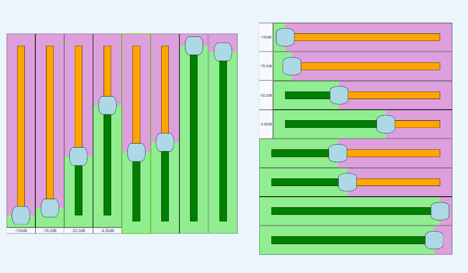
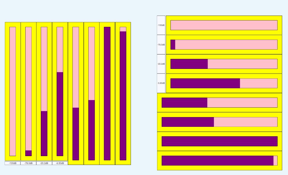
meter {
  -qsc-render-style: layer;
  -qsc-meter-indicator-class: meter-indicator;
  background-color: yellow;
  border: 1px black;
  padding: 20px;
}

meter:value(1) {
  background-color: chocolate;
  border: 1px black;
}

.meter-indicator {
  background-color: pink;
  border: 1px black;
}

.meter-indicator:value(1) {
  background-color: purple;
  border: 1px black;
}
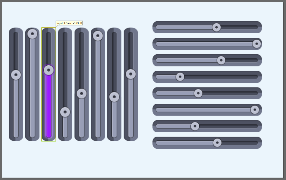
fader {
  background-color: transparent;
  border: 0px transparent;
  -qsc-render-style: layer;
  -qsc-fader-cap-class: fader-cap;
}

fader:pressed { -qsc-fader-cap-class: fader-cap-press; }

.fader-cap {
  background-image: url(images/cap.png);
}

.fader-cap-press {
  background-image: url(images/cap-press.png);
}

.fancy-vertical {
  -qsc-fader-cap-width: 90vw;
  -qsc-fader-cap-height: 90vw;
  padding: 0%;
  background-image: url(images/v-background.png);
}

.fancy-vertical:value(1) {
  background-image: url(images/v-background-on.png);
}
.fancy-vertical:value(1):pressed {
  background-image: url(images/v-background-on-press.png);
}

.fancy-horizontal {
  -qsc-fader-cap-width: 90vh;
  -qsc-fader-cap-height: 90vh;
  padding: 0%;
  background-image: url(images/h-background.png);
}

.fancy-horizontal:value(1) {
  background-image: url(images/h-background-on.png);
}
.fancy-horizontal:value(1):pressed {
  background-image: url(images/h-background-on-press.png);
}
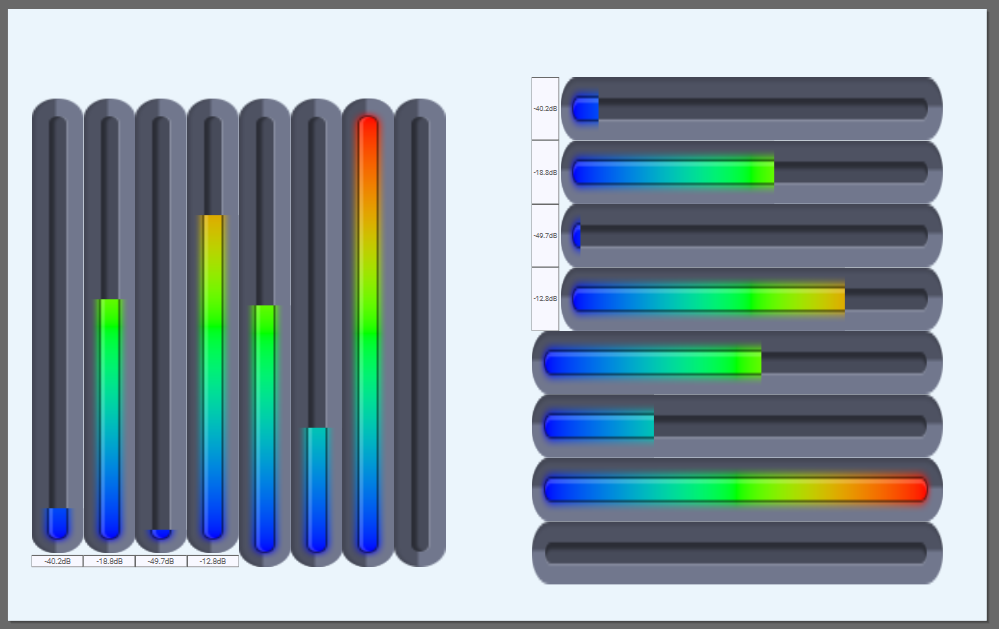
meter {
  padding: 0%;
  background-color: transparent;
  border: 0px transparent;
  -qsc-render-style: layer;
}

.meter-vertical {
  -qsc-meter-indicator-class: meter-vertical-indicator;
  background-image: url(images/v-background.png);
}

.meter-vertical-indicator:value(1) {
  background-image: url(images/v-meter-background.png);
}

.meter-horizontal {
  background-image: url(images/h-background.png);
  -qsc-meter-indicator-class: meter-horizontal-indicator;
}

.meter-horizontal-indicator:value(1) {
  background-image: url(images/h-meter-background.png);
}
Creating, Installing, Applying, and Importing a Style
Create a new folder within the \Users\user-name\Documents\QSC\Q-SYS Designer\Styles folder on your PC. This folder name becomes the style name in Designer. Create a file called style.css and place it and any images or custom fonts you plan to reference in this folder.
Use a text or code editor to author the style. This example shows Visual Studio Code.
Note: Click here to see the CSS content shown in this video.
Go to Tools > Manage UCI Styles to install the style.
When you select the installed style, the elements of the UCI receive the styling from the style.css file.
After you apply the style, you can optionally fine-tune what CSS classes are applied to each element in the UCI. Select a UCI element and use the CSS Class Name property to assign one or more classes. In this example, the fader already has the GainLevelFader class assigned, which sets its color and border width. However, the user desires to use the same background color as the knob, so he selects the GainLevelKnob class as well.
You can use @import to import a style into another style. You simply reference the style to import by its name. Note that:
-
Imported styles must already be installed in the Q-SYS design.
-
After import, the available classes are those from the imported style combined with those from the base style.
-
Selector declarations are combined. That is, if the imported style and base style both define a selector, the end result is a combination of both, with the imported selector definition ordered first and the base second.
-
Variables are also combined in the same way as selectors.
-
Images and fonts referenced in imported styles are relative to that style. If you want to reference an imported image in the base style, you must use a relative URL
For example, here is an existing CSS style called "Dash" that we want to import. The Dash style includes a font and image:
@font-face {
  font-family: dash;
  src: url(dashicons.ttf);
}

:root {
  --var-1 : blue;
  --var-2 : 3px red;
}

.test {
  border: 10px chartreuse;
  background-image: url("core_blue.png");
}

.dashicons-admin-appearance {
  -qsc-icon-font: dash;
  -qsc-icon: "\f100";
}

.dashicons-admin-collapse {
  -qsc-icon-font: dash;
  -qsc-icon: "\f148";
}
And here is another style (the "base" style) importing the Dash style:
@import url("Dash");

:root {
  --base-var: green;
}

page {
  background: linear-gradient(var(--base-var), rgb(54, 53, 53));
  border: var(--var-2);
}

.ref-style-image {
  background: url("../Dash/core_blue.png");
}

.dashicons-admin-collapse {
  -qsc-icon-color: chartreuse;
}
Setting CSS Properties, Pressed Button Styles, Sizes, and Variables
In this example, a TrueType Font (TTF) font is imported.
@font-face {
  font-family: "MyFont";
  src: url(myfont.ttf );
}
In this example, and OpenType font is imported.
Note: To correctly import OpenType (OTF) fonts in your CSS, you must include the format parameter to ensure the fonts load properly.
@font-face {
  font-family: "FontName";
  src: url(fonts/FontName.otf );
  format: ("opentype");
}
Button types, such as momentary, trigger, toggle, and state trigger, offer various functionalities for interactions, allowing for actions that are temporary, single-use, switchable, or multi-state, respectively, to enhance control and flexibility.
|
Button Type |
Purpose |
|---|---|
|
Momentary |
A button that remains active only while being pressed. |
|
Snapshot |
Under the hood, a snapshot button is a state trigger. |
|
Trigger |
A button that activates an action when pressed but does not maintain a state. |
|
Toggle |
A button that switches between two states (on/off) each time it is pressed. |
|
State Trigger |
A button that can have multiple states and changes state each time it is pressed. |
Each Button Type allows for enhanced views. For example, one of the buttons is defined to show a specific background color, border, font family, text color, font size, and border of the button.
button {
  background-color: #654236; /* This sets the background color of the button to a brownish shade */
  border: 1px #505050; /* This defines the button's border to be 1 pixel wide and grey in color */
  font-family: "Open Sans"; /* This specifies that the text inside the button will use the Open Sans font */
  color: #F3F2F1; /* This sets the color of the button text to a very light grey */
  font-size: 40px; /* This sets the size of the button text to 40 pixels */
  border-radius: 10px; /* This sets the corners of the button to be rounded by 10px */
When pressing the button, the background color will change to one color, and when releasing the button it will change to another color.
button:pressed {
  background-color: var(--Color4);
  border: var(--BorderDecoration) var(--Color2);
}
For toggles and momentary buttons, they mostly track each other. Button goes high: value is 1. Button goes low: value is 0.
button:value(1) {
  background-color: var(--Color2Light);
}
For the snapshot, the value is set to value(1) when true, or value(0) when false.
button {
  .buttonsnapshot:value(1) /* This sets the button to a value of 1 and/or true */
}Defined CSS style properties override the same properties in Designer. For example, in this style.css file, all buttons are defined to use a blue background. Therefore, if a button is set to use red in the Designer properties, it is overridden by the applied style and therefore uses blue. Note, however, that because there is no font size defined in the style, the size specified in Designer is used.
button{
    background: Blue;
    font-family: Lato;
    font-face: Bold;
}
In this example, the On state of the button is set with button:value(1). The code sets the On state color for all buttons to be red:
button:value(1){
    background: Red;
}
To apply styling to a subset of items (for example, source buttons), you first define a class in the CSS document. The example code below adds a class for preset buttons and sets the buttons to be green when Off and orange when On. Note that you can use names, RGB values, or RGBA values when defining colors.
.source{
    background: Green;
}
.souce:value(1){
    background: rgb(255, 174, 0);
}Use the :pressed selector to define a style specific to a UCI button that has been pressed, and optionally define whether that style is used depending on the button's value.
Here's the definition for a button with an unpressed color of gray and a pressed color of red:
.myButton {
  background-color: gray;
}

.myButton:pressed {
  background-color: red;
}
And here's a definition for a pressed color of green but only if the button is pressed and has a value of 1:
.myButton:pressed:value(1) {
  background-color: green;
}Some properties (for example, font-size) allow you to define them as a percentage of the containing object's width or height using these values:
-
vw- percentage of width -
vh- percentage of height -
vmin- percentage of width or height, whichever is smaller -
vmax- percentage of width or height, whichever is larger
For example:
.someclass {
  font-size: 90vh; // font size will be 90% of height
}
To see what properties support viewport relative sizes, refer to the table footnotes in the Supported CSS Properties topic.
Q-SYS supports CSS variables in the :root selector. Variables can define multiple terms, and each must be prefixed with a --.
:root {
    --fancy-color: yellow;
    --fancy-border-color: chartreuse;
    --fancy-border: 30px orange;
}
Use the var() function to refer to the variable definition in your style:
.my-style {
    color: var(--fancy-color);
    border: var(--fancy-border);
    border-bottom: 5px var(--fancy-color, orange);
}
Tip: You can define a fallback value (after the comma) to be used if the variable with the given name hasn't been defined, which is useful when including other CSS files. In the above example, the fallback value for the border-bottom color is orange.
